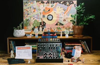
Moog introduces two all-in-one kits designed for beginners, each paired with a spirited, fun and colorful menagerie of illustrations.
The Obsidian Virtual Concept House is a futuristic home designed for Black families, by Black families.
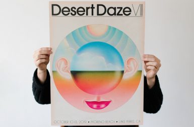
With a portfolio pulsing with a surreal experimental glow, Aaron Lowell Denton has carved out a career as a musician’s artist.
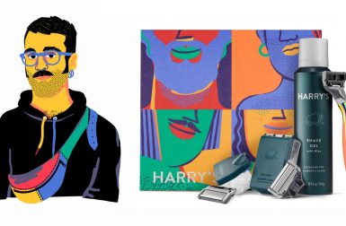
Harry's collaborated with José Roda to create the Design with Pride campaign for Pride 2020 to complement a special edition shave kit.
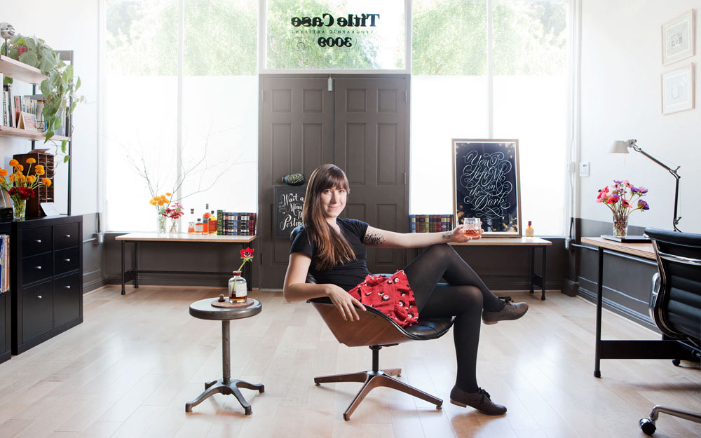
On this episode of Clever, Amy Devers talks to lettering artist Lauren Hom, who now has made an art out of freelancing.
Artist + author Lisa Congdon talks about how she discovered painting, the power of the Internet, and how perfectionism isn't for her.
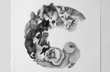
An Alphabet of Dogs is a book filled just with under 200 dog breeds that are playfully arranged to form the letters of the alphabet.
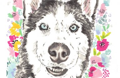
These colorful pet portraits from artist Jo Chambers make excellent gifts for all the animal lovers in your life (yourself included)!
Amy + Jaime talk to illustrator Abbey Lossing, who always felt drawn to freelance and set herself up for success right out of school.
After overcoming obstacles, such as the shift to digital, costume concept artist Gina DeDomenico Flanagan helps outfit superheroes. Listen!
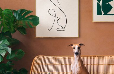
Swedish startup Dogmade is simplifying the process of obtaining modern, custom artwork with their unique fine art prints.
Designer/illustrator Jessica Hische talks about the challenges + triumphs of her work, plus tells the story of her first children's book.
A new card game illustrated by Jean Jullien celebrates dogs who can't be trusted.
You can support your favorite illustrators by checking out their art on Society6!
Artist and illustrator Lisa Cinar knows dogs.