DMTV Milkshake: Transcending the Color of the Year With Backdrop’s Natalie + Caleb Ebel
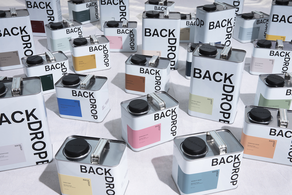


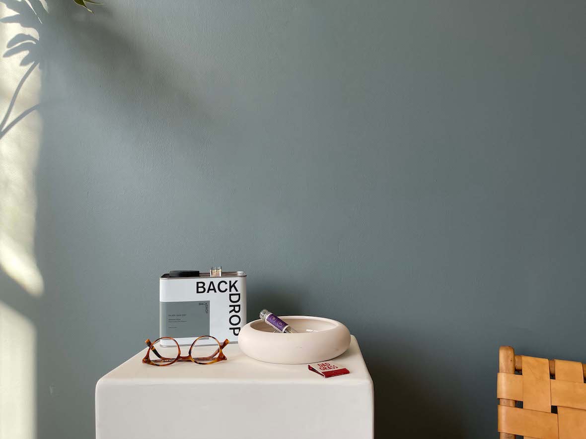

No one names paints better than Natalie and Caleb Ebel, the husband-and-wife co-founders of Backdrop. Silver Lake Dad? The slate blue-gray, Natalie says, is a tribute to her partner: “It’s kind of like a running joke,” she says. “What is a Silver Lake dad? They live in Silver Lake. They listen to NPR. They do school drop-off.” (“They’re a walking cliché,” Caleb adds.) Silver Lake Dad sits beside Disco Nap (a light acid yellow), Tan Lines (a deep yellow), Blue Is the Coolest Color (a saturated blue), Weekend Upstate (dark green with a hint of blue). Surf Camp is so emotionally resonant that it does the work of selling itself: “Sometimes people buy the paint because of the names,” Caleb says. “Surf Camp’s a best seller – it’s a super-interesting, dynamic dark blue with green undertones, but we get people messaging us all the time that ‘I just bought that because I wanted my backdrop to be Surf Camp.’”
That sense of fun, creativity, and purpose defines the LA-based line, and it’s so persuasive that the paint brand is the only one we know of to have a merch line – or, indeed, to be “pretty much sold out” an 11-piece collaboration with Madewell, featuring overalls, chore jackets, socks, hats, and shoes. “That was so cool – that was basically a dream come true,” Natalie says. “Even Caleb wears it. It’s unisex and it’s super comfortable.”
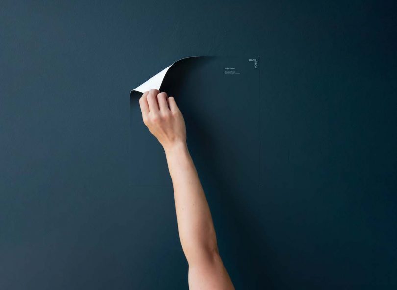
Surf Camp swatch

Silver Lake Dad
Also in this week’s Milkshake: We talk to the pair about finding their niche within an industry that often trades on exclusivity (“The five-star experience at the three-star price is the best of all worlds,” Caleb says) and about the “color of the year” trend – a yearly marketing event that Team Backdrop seems happy to skip. “People often ask us what the trendy color of the year for this year – and every year – will be, and we always have the same response,” Natalie says. “We created Backdrop because we wanted to have a timeless palette that lived on forever. I jokingly say Supermoon is our color of the year, this year and everywhere – it’s a pure white. The thing that’s really always kind of thrown me off about color of the year is – when it is announced by some of these institutions, what are you supposed to do with it? Are you supposed to wear it? Are you supposed to paint it? What is the purpose of it? Color is highly personal and no one should be choosing that for you.”
To see more, tune in!
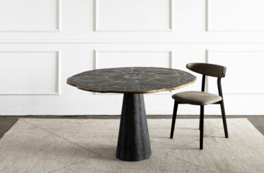
Photo: @workingholidaystudio
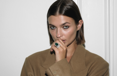
Photo: @french.ca
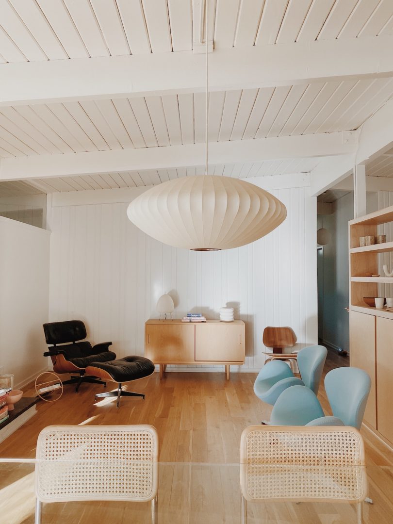
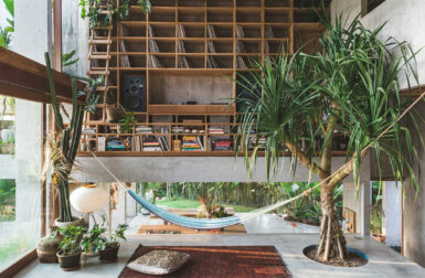
Photo: @kaleykocinski
Diana Ostrom, who has written for Wallpaper, Interior Design, ID, The Wall Street Journal, and other outlets, is also the author of Faraway Places, a newsletter about travel.
Milkshake, DMTV (Design Milk TV)’s first regular series, shakes up the traditional interview format by asking designers, creatives, educators and industry professionals to select interview questions at random from their favorite bowl or vessel. During their candid discussions, you’ll not only gain a peek into their personal homeware collections, but also valuable insights into their work, life and passions.