


Since its earliest years, Apple’s utilization of iterative improvements has been a hallmark of the company’s design and engineering ethos – operating not as a bug, but as a feature. For every major change in course the Cupertino company has announced over the years – the original iMac in 1998, 2007’s unveiling of the first iPhone, and most recently the launch of M1 Apple Silicon-powered machines, to name a few – the years between generations of devices such as the iPhone and Macs are often explicated by significant advancements of technologies paired with subtle modifications delivering a sense of continuity rather than drastic cosmetic alterations. Nowhere is this process of shaving the clay more evident than with the Apple Watch.

watchOS 8 includes watch faces optimized to take advantage of the larger Apple Watch Series 7 display, including a new Contour face and also Modular Duo face.
Now in its seventh iteration since launching in 2015, the wearable has continued to improve in form and function with every passing year, while retaining a recognizable external design DNA across its timeline and arguably attaining an iconic status within the category it firmly established.
No matter the hyperbole of marketing, a cursory glance of last year’s Apple Watch Series 6 does not present a remarkably different impression from its earlier predecessors. The Apple Watch Series 7, despite offering the largest, most advanced display the company has ever offered, doesn’t diverge with any remarkable discernible traits that broadcast “newer, better!”. The crown dial is still there, as is its rectilinear external design. That is, until the Series 7’s larger Always-On Retina display is viewed at full brightness, and its roomier and optimized improvements come to light across its strengthened crack-resistant front crystal – one nearly 20 percent larger and up to 70 percent brighter indoors than that of the Apple Watch Series 6. The experience is akin to walking into a modest sized room renovated with higher ceilings and skylights; the dimensions may remain the same, but perceptually the experience is positively altered – same, but also newer and better.
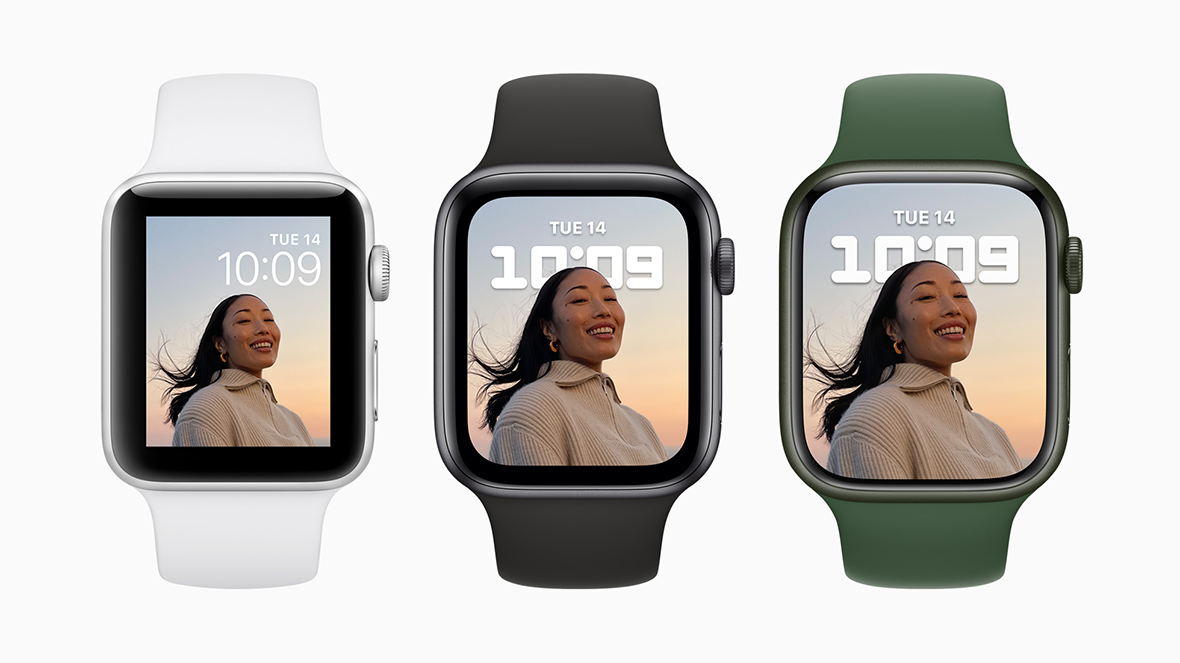
The Apple Watch Series 7’s larger display permits information rich watch faces like the new Modular Duo face, while making previewing photos easier and more immersive.
Apple’s forte has always been delivering a degree of experiential discovery of detail, and so too does the Apple Watch Series 7 utilize a dimensional improvement paired with “hundreds of small but impactful changes” benefitting how users interact with a device by physical nature can present navigational limits and challenges in legibility. While rumors of a more severe and sharply formed design brewed before the Apple Watch Series 7 announcement, the eventual evolutionary reveal spotlighted Apple’s attentiveness to form dictating function informed by previous generations.
When asked about the adherence to a form mostly indistinguishable from previous generations beyond its larger screen – especially in light of Apple’s design language noticeably veering toward a sharper, rectilinear detailing across most of its newest mobile and computing designs – Apple’s readied response would lean heavily into the argument their “hardware ends where software begins,” inviting a closer inspection of the proverbial paint upon the canvas.

Over a recent interview/chat with Stan Ng, Vice President Product Marketing, Apple Watch and Alan Dye, VP of Human Interface Design, with Design Milk, the pair would point out the new Series 7 larger display available in 41mm and 45mm sizes was crafted “for the wrist and the constraints of the limitations of the display” where “every pixel counts…with no wasted space.” And indeed, Apple’s design and engineering team have pushed the limits of quadrilateral design further toward the bounds of its previous predecessor without sacrificing the identifiable characteristics of what makes an Apple Watch an Apple Watch.
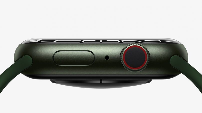
Last year’s 3mm bezels are now a barely there 1.7mm, disappearing toward a rounded refractive edge extending into a nearly organic curvature. The effect again is subtle, and most pronounced when seen at an angle or from the side, yet quietly satisfying in the same way Apple nearly fetishized the chamfered edges of their iPhone into a distinguishable tactile pleasure point. Like a polished river stone, I’ve found myself tracing the watch’s seamless rounded edges over and over again, struggling to feel the seams between case and display.
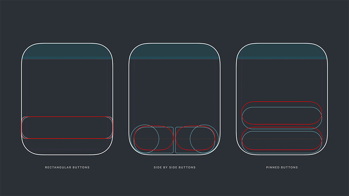
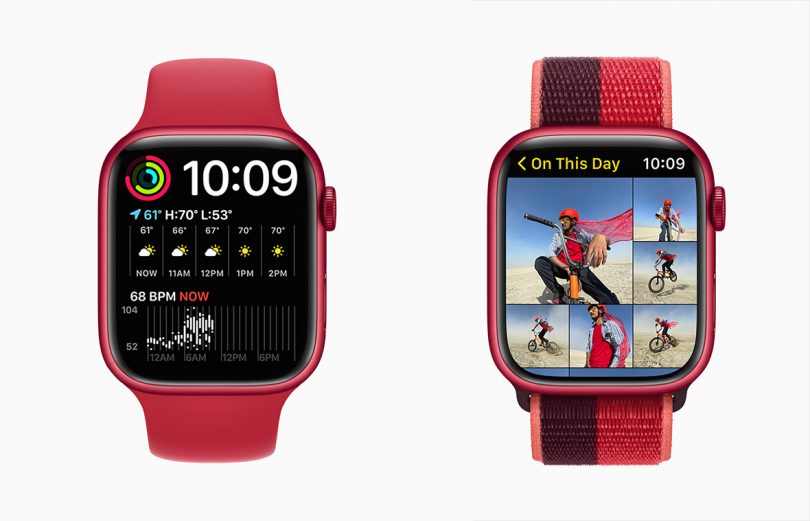
More importantly, the maximization of screen real estate permits a more information-dense display. This not only circumvents crowding, but also spotlights how much bigger the display really is in use, an effect attributed to countless optimizations superimposed across a new grid system created for the new Apple Watch. These optimized elements include flexible and variable customized typefaces (San Francisco), altered navigation sizing and layout, buttons redesigned to follow the physical curves of the display, and redrawn watch faces literally pushing to very edges of the watch display (most noticeable with the new Contour face that stretches its numerical display with organic fluidity).

Dye notes the Series 7’s gentler corners required an entire redesign of the device’s UI, one that wasn’t merely scaled up to take advantage of the display but optimized for legibility and improved navigation. Side-by-side comparisons between the Series 6 and Series 7 reveal a multitude of typographic and graphical changes the latest watchOS delivers in harmony with the latest hardware; again, not immediately noticeable nor revolutionary, but with regular use, appreciated for improved everyday interactions while tapping and typing. The resulting combination of minimizing and maximization even permits the Apple Watch Series 7 to offer a QWERTY keyboard that can be tapped or swiped with QuickPath, allowing users to swipe to type, something that would prove challenging to accomplish with accuracy with even its most immediate predecessor.

As a longtime Apple Watch wearer, I can’t help conclude these improvements delivered by the Series 7 are inarguably iterative. But that’s not a knock, simply indicative of Apple’s commitment to improve their designs at their own pace, alongside emphasizing the longevity offered by each generation. If practice makes perfect, Apple seems dedicated to perfect the practice of the small screen user experience. The sum of the Apple Watch Series 7’s elemental improvements deliver the best Apple Watch experience to date – mostly because of its gloriously larger display – certainly the best option today for anyone seeking a wearable delivering a waste not, want not experience realized upon the wrist.