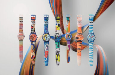

The Apple Watch released this Tuesday marks the Cupertino company’s formal foray into tech wearables, and many keen-eyed design – pardon the pun – watchers like Alissa Walker over at Gizmodo immediately noticed, alongside the hardware announcement, Apple also unveiled a completely new typeface designed specifically to complement the screens of their new digital timepieces.
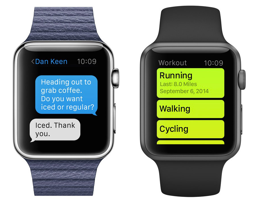
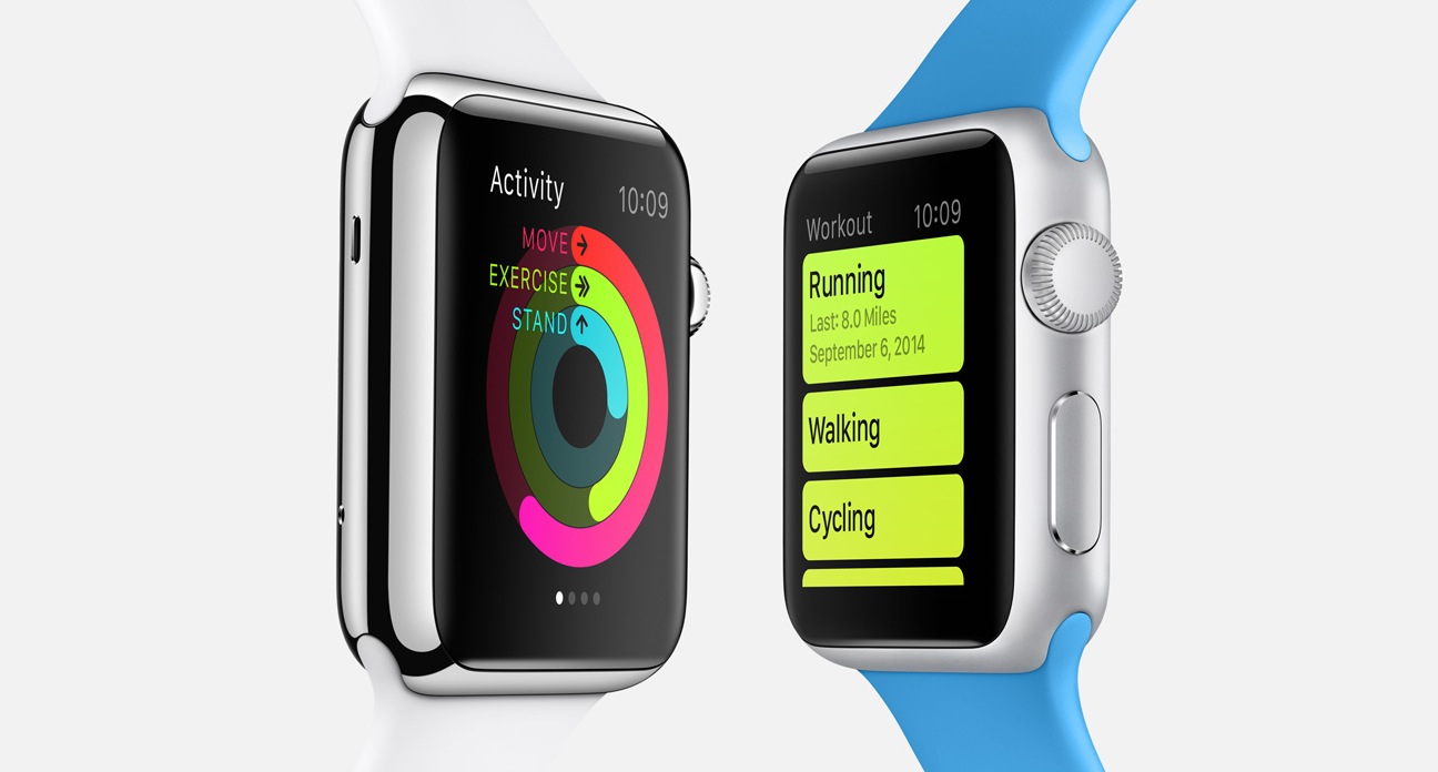
There’s been a lot of reshuffling in Apple’s alpha-numeric toolbox lately, with Helvetica Neue replacing Helvetica in iOS and Lucida Grande switched out for Helvetica Neue for the upcoming release of OS X Yosemite. For their new wearable technology Apple’s design team recognized the need for a flexible weight and legible san serif typeface offering maximum quick-glance legibility demanding minimal effort on the viewer’s part when using a 38mm-42mm screen (a.k.a. the squint factor).
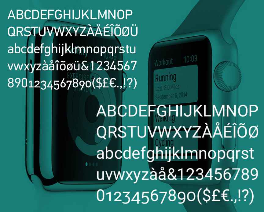
The resulting yet-to-be-named typeface shares some characteristics with an existing font family, Process Type Foundry’s Colfax [PDF] (perhaps alongside Univers and DIN), but the foundry notes it is not the same font and in comparison, Apple’s characters are taller.

Google’s Roboto typeface was also optimized for small screen legibility and there are some notable similarities between the Android san serif and Apple’s latest font.
The typography set is already debating the myriad of merits and misses of the fresh new fonts, but you can be sure Apple’s internal design team will continually fine-tune their custom font with the evolution of their devices’ Retina displays. Now if we can just get an official name…
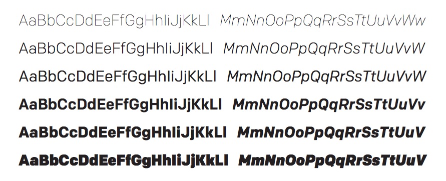
Designed by Eric Olson in 2012 for Process Type Foundry, Colfax is an oval sans serif influenced by the Aurora Grotesk series and Neuzeit, a typeface designed by C.W. Pischiner for the Stempel foundry in 1928. Similarities between Colfax and the Apple Watch font can be made in comparison, above and below.