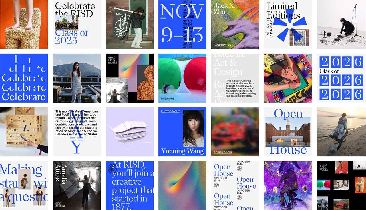
New York-based graphic designer Dylan Mulvaney is Head of Design at Gretel. His expertise lies in translating core values, strategy, and voice into striking visual executions for clients like Apple, Netflix, RISD, Vice, and MoMA. Others include the Museum of Modern Art, Knoll, Aesop, Vanity Fair, and the New York Times Magazine.
Dylan’s work has been featured by Wired, Fast Company, Creative Review, Communication Arts, and Brand New. He’s also been honored by the D&AD, the Art Directors Club, the Type Directors Club, and the Fast Company Innovation by Design Awards. Dylan regularly guest lectures and critiques at ArtCenter, the School of Visual Arts, Pratt, and The Savannah College of Art and Design.
Today, Dylan Mulvaney is joining us for Friday Five!
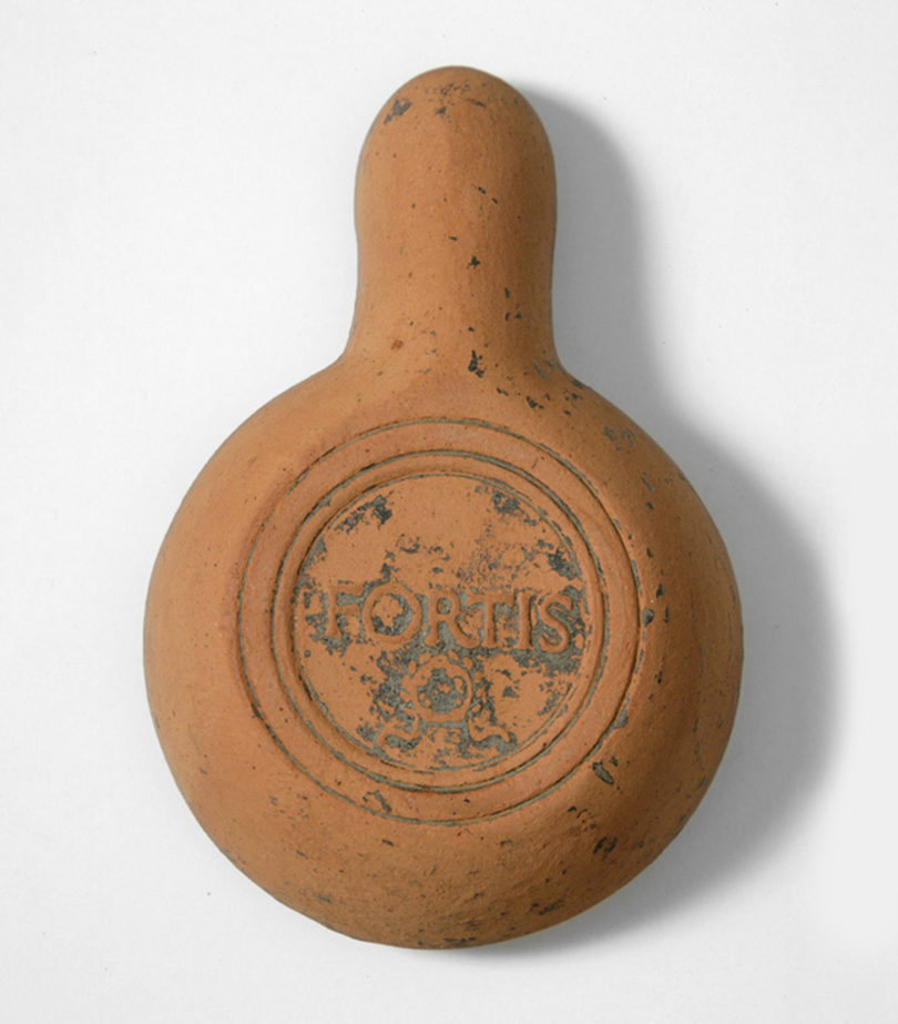
1. The Fortis Factory Lamp (150 AD)
The Fortis Factory Lamp marks the beginning of branding as we know it today. While branding began in Egypt around 2000 BC as a mark of ownership for cattle, Ancient Romans borrowed the technique and added meaning. Branding became a mark of both origin and quality.
The Factory Lamp was one of the Romans’ first mass-produced products. Manufacturers stamped their names into the lamps’ clay bottoms to physically distinguish them from the competition and build a reputation for quality, allowing them to charge a premium. These stamps were the first use of a brand to identify a manufactured product. Fortis was the most popular Roman pottery brand. It was sold on three continents and became so successful that its stamp was copied and reproduced, making it the earliest example of a pirated brand.
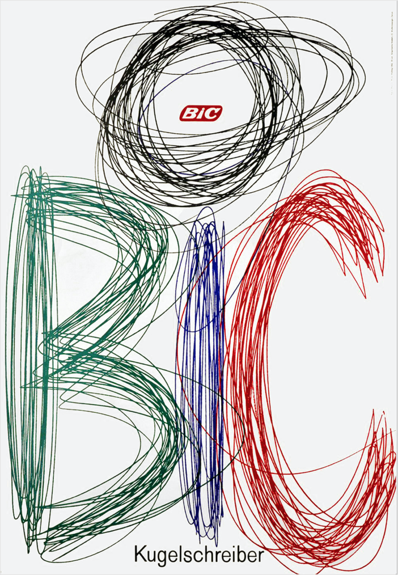
2. Ruedi Külling’s BIC Pen Poster (1962)
Ruedi Külling’s BIC pen poster illustrates my design mantra – the problem is the solution. This mantra is especially true for branding. Unlike other kinds of design, branding cannot be a one-off expression of my tastes or interests. I am building a completely custom representation of my client. Like couture clothing, it is made for an individual and tailored to their specific needs.
As I design a brand, I try to find organic solutions that convert problems into advantages – and the clearer the problem is, the clearer the solution is. This poster is a beautifully blunt example of that mantra in action. The problem: create a poster advertising BIC ballpoint pens. The solution grows straight from there. The pens are used for handwriting. They come in four colors. The company’s name is BIC. Done.
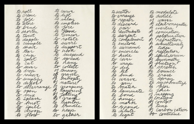
3. Richard Serra’s Verb List (1967)
Richard Serra’s Verb List mirrors a crucial part of my process. In his late 20s, Serra wrote this list of verbal prompts, then translated each behavior into sculpture. My early design process is similar. I start by collating and filtering the results of our research and strategy phases into a list of themes and behaviors. Narrowing and prioritizing those keywords points the way for my visual and verbal exploration.
At Gretel, we create living brands driven by a signature behavior – something meaningful and memorable that drives composition, motion, and interaction. Signature behaviors help us build brands that adapt and create a consistent impression without being repetitive or formulaic.
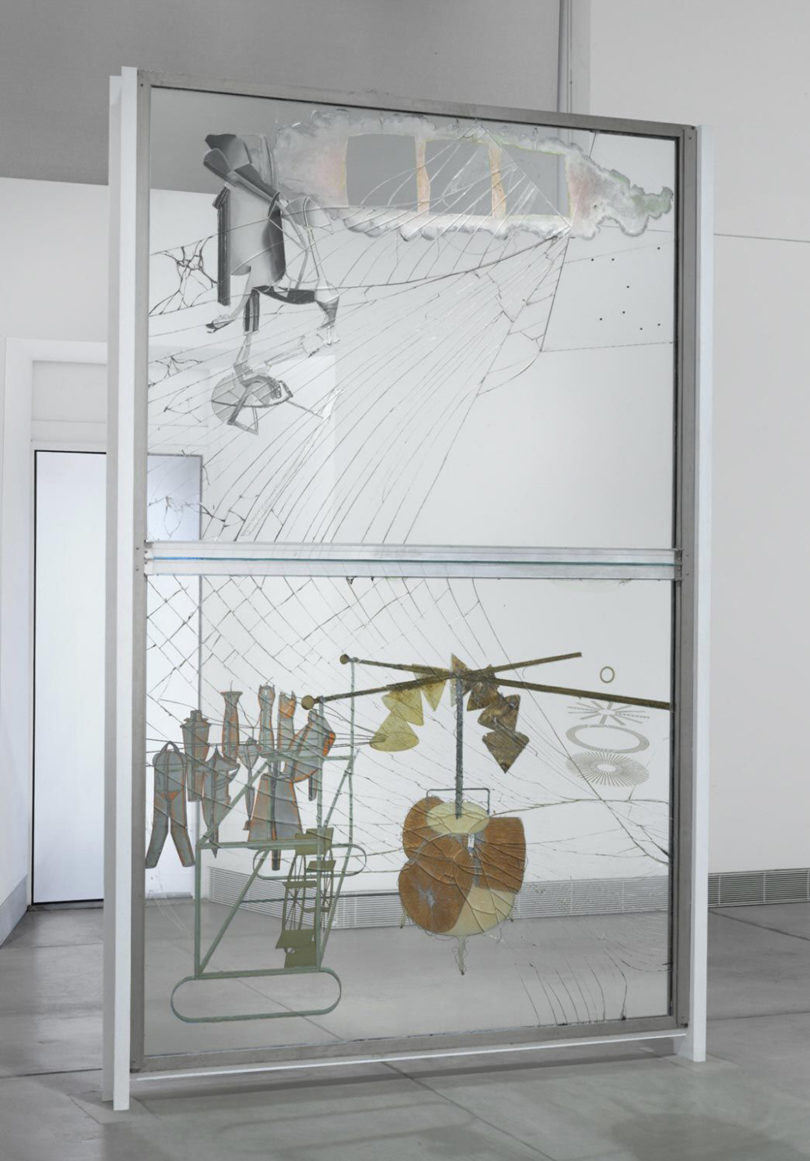
4. Marcel Duchamp’s “The Bride Stripped Bare by Her Bachelors, Even” (1915–1923)
Marcel Duchamp’s “The Bride Stripped Bare by Her Bachelors, Even” reminds me to embrace outside influences. Art handlers dropped Duchamp’s work as they moved it from its first exhibition. The accident created spiderweb cracks mirroring the composition’s flow. Rather than repair the work, Duchamp declared that it was finally complete.
As I move through the design process, I leave room for new ideas, mistakes, and misunderstandings. They are key ingredients in fresh and interesting work. Offhand suggestions, accidental overlaps, and corrupted files have all led to ideas I wouldn’t have discovered otherwise.
5. Andy Warhol’s Rejection Letter from MoMA (1956)
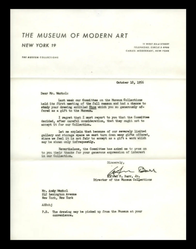
Andy Warhol’s rejection letter from MoMA inspires me to keep pushing. Warhol began as a commercial illustrator in 1950s New York. By 1956, his signature style had become so successful that he started to shift into fine art. To help establish his reputation, Warhol offered MoMA his drawing “Shoe” as a gift. The museum, which now has hundreds of Warhol’s works in its collection, rejected the gift because of their “severely limited gallery and storage space.”
Sometimes your work is embraced and celebrated. Other times, it can be misunderstood or outright rejected. It happens to the best of us. For me, the inevitable ups and downs have reinforced an important idea I carry from project to project. Design is a process, not an end product. As designers, we need to be open, adaptable, and committed – whatever the circumstances.
Work by Dylan Mulvaney:
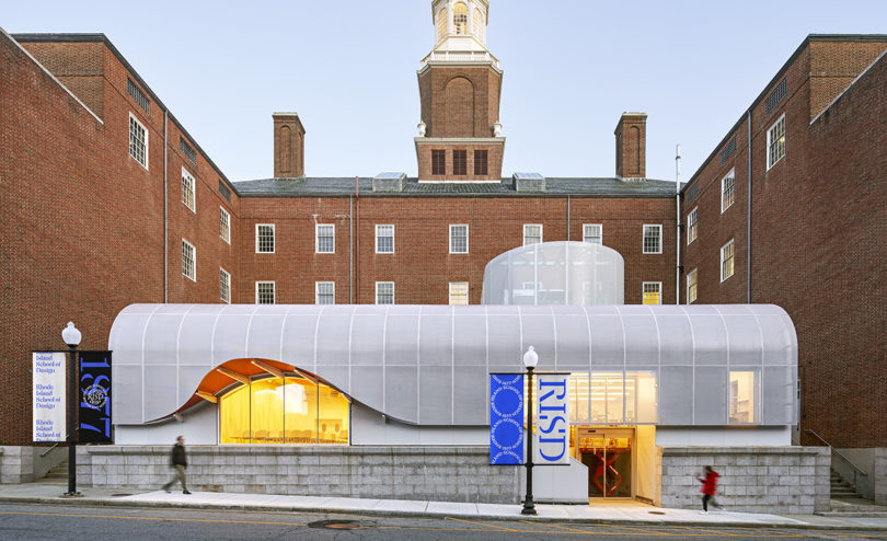
RISD Banners \\\ Comprehensive identity framework for one of the leading art and design schools in the world. \\\ Photo: Gretel
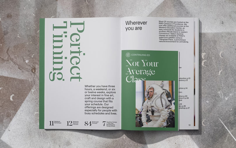
RISD Print \\\ Comprehensive identity framework for one of the leading art and design schools in the world. \\\ Photo: Gretel


