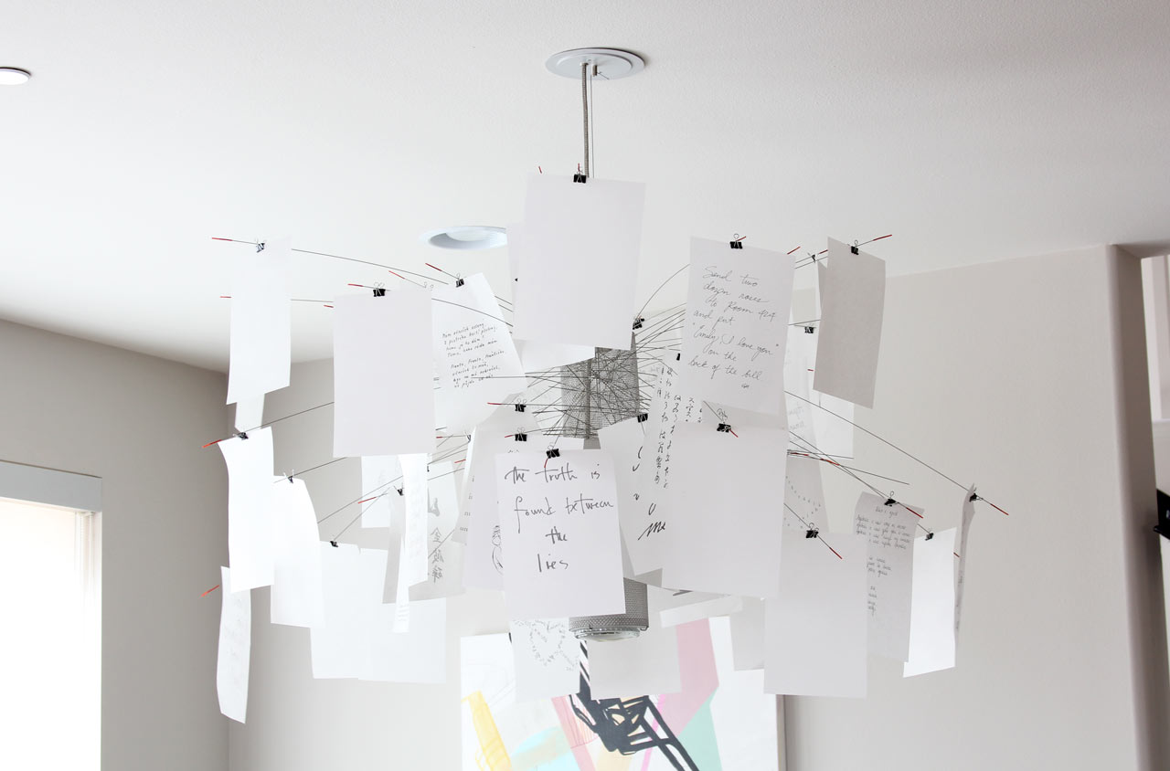


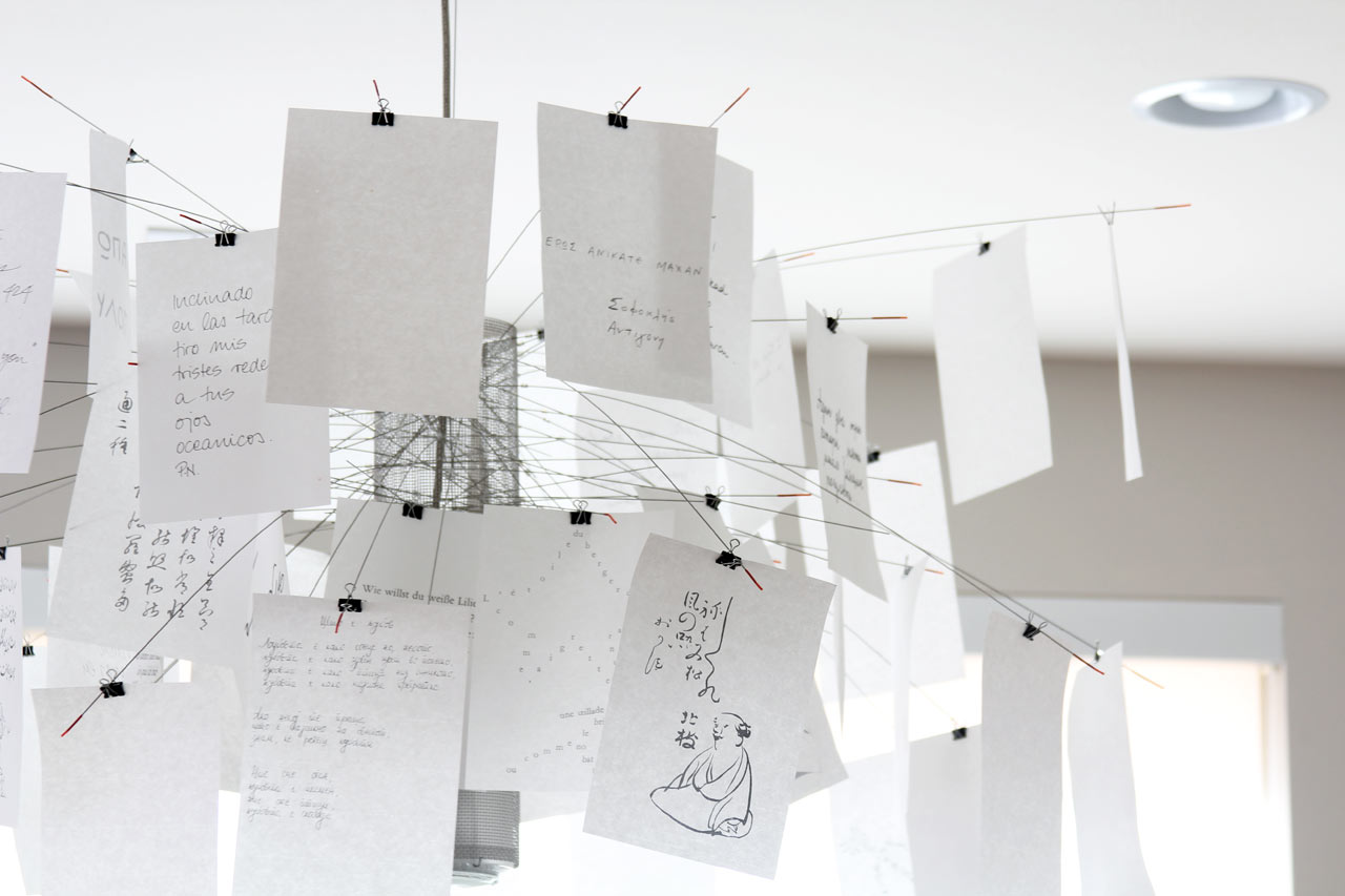
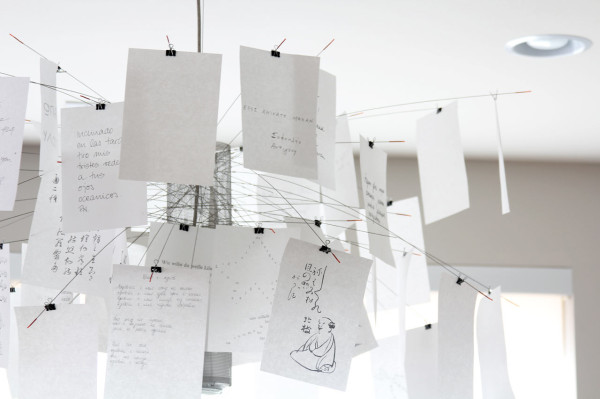
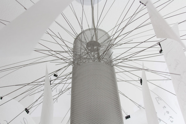
I love that Maurer designed the lamp not only to be playful, light and airy but also to be entirely customized and assembled by its owner. Each individual arm is inserted wherever you desire. Then you can slide the binder clip up and down the wire to determine the best placement. (NOTE: before you decide to assemble the lamp, make sure you’re in a very zen place. It takes a lot of patience. And then some more patience. Oh, and make sure you have wine ready for after you’re done, because you will need it.) And finally, you choose whether to use Maurer’s included white tissue papers, pre-printed with a variety of quips and drawings, or make your own using the blanks that he also includes in the package. OR, you can go entirely rogue! That’s what I decided to do… but first, here are some shots of the lamp with the original white design:

I like the freshness and airiness of this configuration.
Because the paper is hung on suspended wires, it’s hard to find the right paper weight to use. The included sheets are a little thicker than tissue paper. At first, I tried using regular paper and cardstock, but both were too heavy and the wires drooped.
Also, because you can view the paper from all angles, it looks best with double-sided paper. Therefore, using some scrapbooking paper was out of the question. Then, I discovered origami paper. Origami paper is lightweight and comes in a variety of sizes and colors (even patterns and metallics!), many of them double-sided. Most of it is square, so that’s what I used in the majority of these designs.
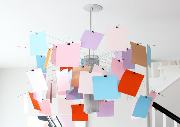
My first configuration was using colored paper. I took colors from the painting and added a few pops of orange, and a few sheets of metallic copper paper. I really liked this but after stepping back, I don’t think I like the orange pops as much as I thought. I think if I were to keep this combination, I’d probably remove them and replace with another pastel, white or one of the other colors already pictured. Or maybe neon pink? :)


Then, I moved onto patterns. I wanted to do something dramatic, so I ordered these op-art inspired black and white origami sheets where the front and back are printed with different patterns. Up close, this was a really cool idea.
However, upon stepping back, it just looked kind of gray.
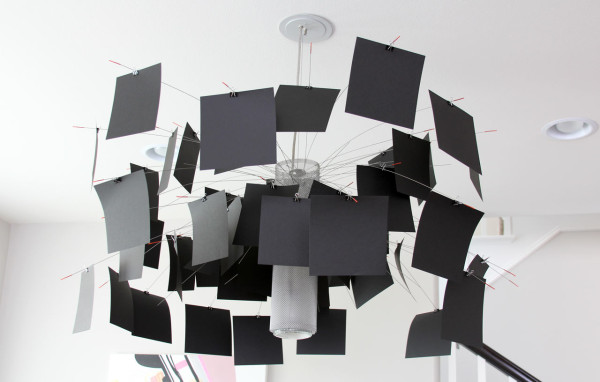

My last iteration was all black. I used an origami paper called TANT. I really liked how this looked, but I also wanted to try it out using the original rectangular size, so I ordered larger sheets of black TANT and trimmed them to be the same size as the original white paper. Here’s what the lamp looks like right now:
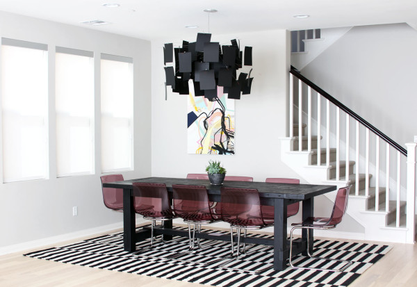
It’s much fuller than the square option, and lets a little less light through, which is OK because we have the recessed cans anyway. I think I’d like to eventually recreate it using lots of my daughter’s drawings… or personal photographs…
Which version is your favorite? What would YOU use?
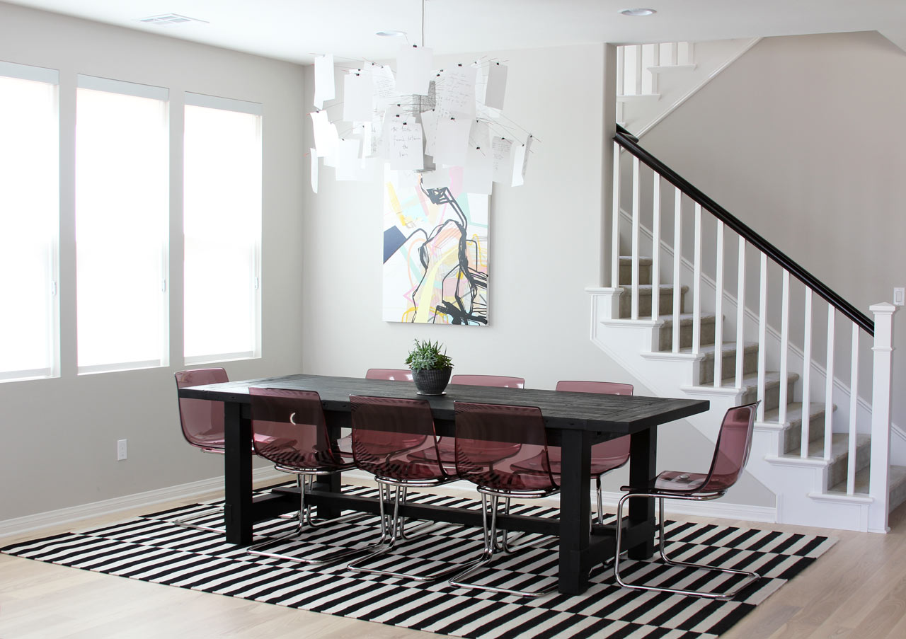
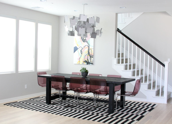
Sources: Ingo Maurer’s Zettel’z 5 Chandelier, IKEA TOBIAS chair in lilac, IKEA Stockholm rug, one of my paintings, Restoration Hardware dining table
Photos by Jaime Derringer.