


James Turrell transformed the Guggenheim into a tripped-out color-changing alien space ship in 2013. Right now, he’s showcasing his first experiments with light at Pace Gallery in two locations in New York.
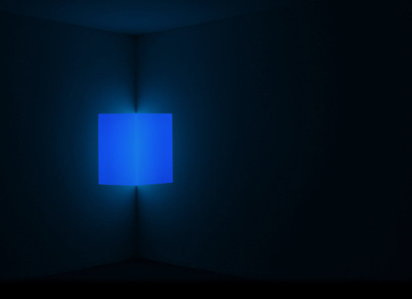
Stufe, Blue. 1968
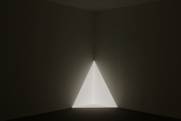
Gard, White. 1967
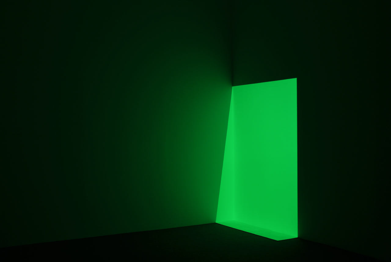
Each piece consists of a simple geometric shape projected against the corner of a room. That’s it… and it’s amazing. Conceived in the mid-60s, Turrell first displayed these works in a vacant hotel, which may explain the construction of single rooms for each sculpture, a lowered gallery ceiling, and the carpeted floors, only for this exhibition.
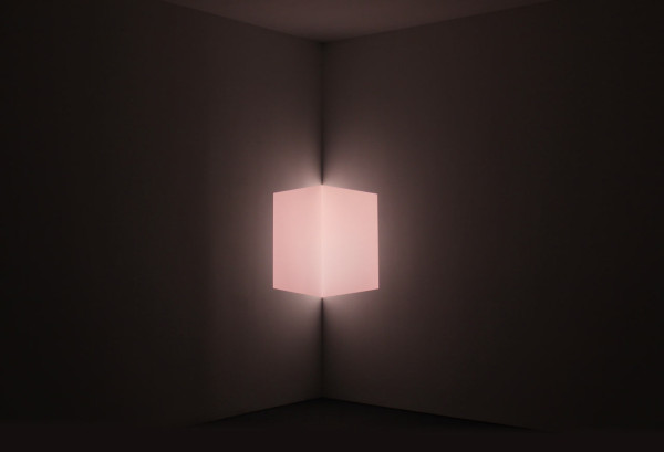
Afrum, Pale Pink. 1967
Though I’ve never seen the apparatus for projections, I read recently that he uses silver-taped 35mm slides. If, like me, you entered art school pre-2000s, you’re familiar with the silver tape you use to “crop” the slides in your art portfolio (so the wall would appear completely black) – which is exactly what he used to mask these shapes by hand. As one would expect, he was also extremely particular about the projector itself, first using a Leitz slide projector, then a custom Xenon projector (if you’re interested, read the full technical journey here).
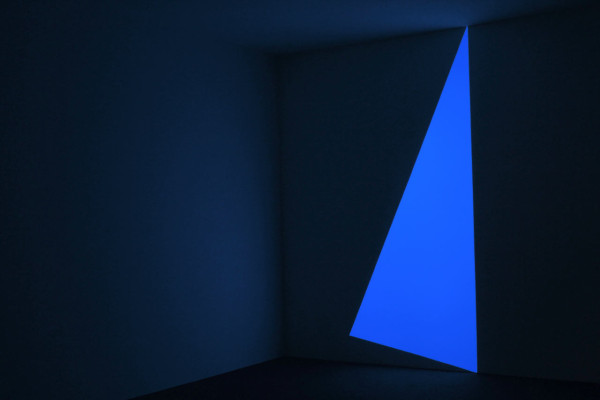
Pullen, Blue. 1968
As HoloLens and this CRAZY Tilt Brush become reality, these analog projections aren’t losing their magic. First, it’s amazing that Turrell successfully achieved the illusion of solid and three-dimensional volume without a computer or video projector, let alone virtual reality goggles. But now viewing these works 50 years later (!!!), their non-digital elements are refreshingly realistic. For example, a grain of dust occasionally and accidentally clings to the edge of a slide in the projector, which translates on the wall to something resembling a hand-cut paper edge. These tiny “flaws” feel more tangible and object-like than a perfect pixelated line, without betraying the work’s precision.
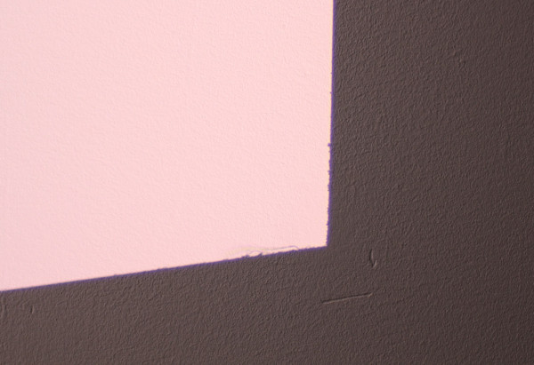
Afrum, Pale Pink. 1967 (detail)
The collection spans two locations of Pace Gallery, and each space includes a unique bonus. In Chelsea, that bonus is a collection of 36 drawings: the 6 projections on view PLUS 30 more variations!

James Turrell, Gard from Projection Piece Drawings, 1970-1971
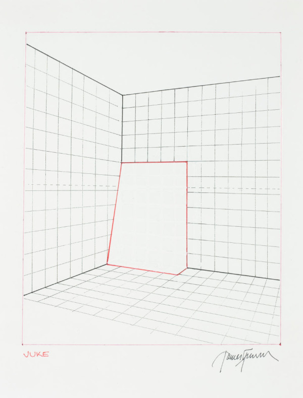
James Turrell, Juke from Projection Piece Drawings, 1970-1971
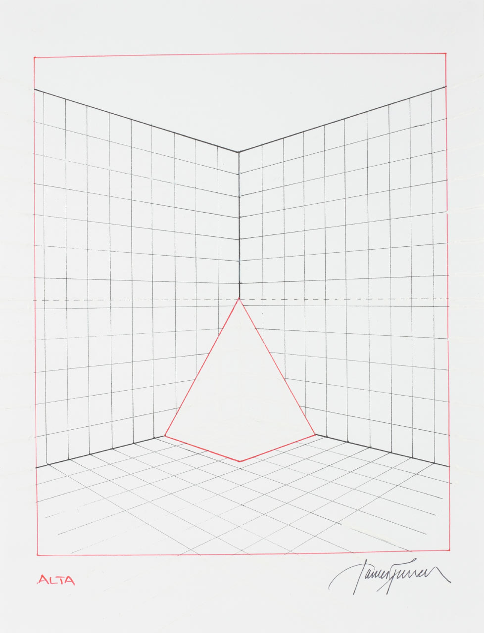
I love the efficiency of his drawing process. It appears as if each work is made up a print or xerox copy of gridded lines. onto which he drew a red shape, and then used white-out to remove the unwanted lines inside. You can see it best below, and even better in person.

James Turrell, Jones-Jones from Projection Piece Drawings, 1970-1971
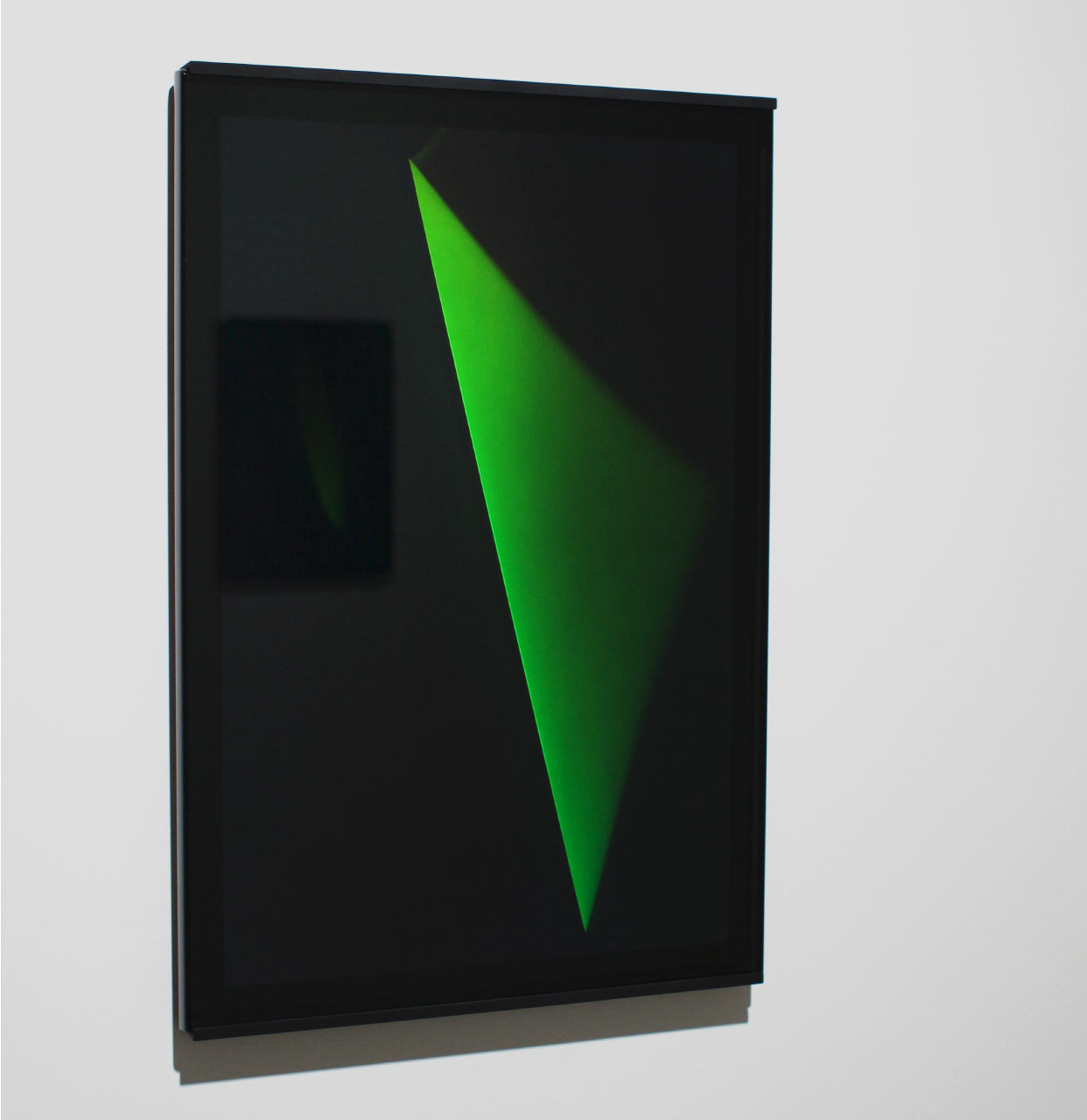
The “bonus” in the midtown gallery location is a series of recent holograms! Created in 2014/2015, they are physically IMPOSSIBLE to photograph, so you either need to run up there immediately, or stretch your imagination while you view the photograph below: This is a holographic green triangle that extends into thin air, straight out from the glass, towards the viewer. It gradually fades into nothing as it reaches the limit of how far a hologram can project away from its source… which Turrell has stretched to nearly a foot.

Untitled (XXXII E) October 2014, reflection hologram
Finally, I want to give a quick shout-out to the unrecognized graphic designers of gallery postcards in general, and whoever designed the material for this show in particular. I’ve seen a number of super-smart gallery postcards, and this one impressed me with it’s simple yet brilliant solution to representing one of these corner light works. Nailed it.

A note on photography: This the selfie show of the season. Everyone looks amazing under this lighting. I pulled a few of my favorites below.
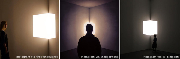
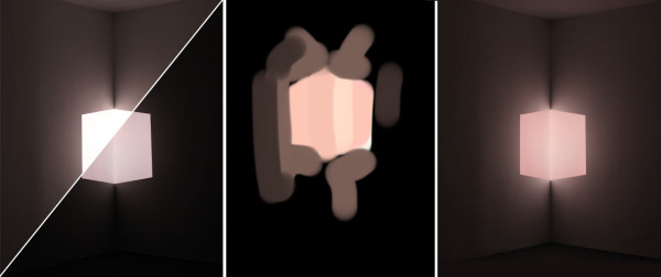
But notice that the Instagram photographs and the postcard above it are the SAME piece (Afrum, Pale Pink) and look COMPLETELY different. The problem is that smart phones, in addition to overexposing the cube, white-balance to the ambient light and therefore make the cube look white. The gallery postcard also doesn’t look correct: it may be “technically true” but it certainly does not look that pink to the naked eye in the gallery at all. So my personal strategy to represent these accurately for this article was to photograph each piece twice with two different exposures to capture the projection and the wall independently (see below on left). I then used the Brushes app on my iPad to sketch a color study in the gallery (the “glow” of the iPad resembled the effect better than a colored pencil on paper), which I used later to color correct in Photoshop when I merged the two exposures. It’s not scientific, and still probably not 100% accurate, but it is the absolute closest I could get to what the actual real experience looks like in person. Go check it out.
Process of photographing Turrell by the author: Two Exposures, iPad Color Study, Final Correction
What: James Turrell: 67 68 69
Where: Pace Gallery, 534 W 25th St & 32 East 57th St
When: May 5 – June 17, 2016
All photographs of projections by the author, David Behringer.
Photographs of drawings by Kerry Ryan McFate / Pace Gallery, © 2016 James Turrell, Pace Gallery
Instagram images via: @edythehughes @sugarwang @_kimgoon