
This spread, House Rules, in the September 2009 issue of Wallpaper* really captured my attention. Wallpaper* is one of the most influential magazines in my collection and it has been since I discovered design. One of my all time favorite designers, Suzy Hoodless, was the first interiors editors at Wallpaper*. She has gone on to create Suzy Hoodless Design Consultancy, and has become a tastemaker of the UK.
The talent behind Wallpaper* didn’t stop with Suzy, but has escalated to new levels through the years, and is at the top of it’s game with the talent of Benjamin Kenton, Deputy Interiors Editor. After attending many lectures organized by Wallpaper* during Architectural Festival, Benjamin Kenton, was inspired at one of the lectures after a discussion on Parker Morris Housing Standards. These standards have been mandatory in the UK since 1967, but just last year more generous standards were introduced. The Parker Morris standards set the rules of how one should live within their home to maximize space.
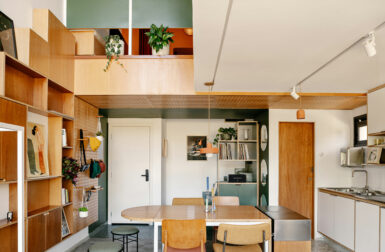
Benjamin Kenton designed a 3-D diagram, with stylized measurements, to create a modern take on these standards. This seems a little ironic because we all know Wallpaper* is not known for following standards. At first glance, I didn’t realize this was a fabricated set rather than an actual interior. I thought the lines drawn on the floor were a great way to divide spaces in an open floorplan and I just loved the annotations spelling out the measurements, details, and the description of the spaces. I then realized this was the “ideal house” spelled out!


The photographer, Matthew Donaldson, suggested the use of strong lighting shining through doors and windows to create a narrative within the space.


The shots from above really do look like a floorplan, but a stylized one at that.
I think this trend of annotating or illustrating what is supposed to “be” is going to start popping up all over. Notice the fish on the plates, the imaginary boundaries within the space, the storage on the walls. Does this form of product design help simplify the end users experience and questions of “How do I use this correctly?” or is this actually a way of simplifying the construction of objects and products?

You may have seen these ideas in the MESSY tablecloth and REM bedclothes by AZE design.

I also love these great products from Pulpo, the Wannabe Table and the Kate M Lights.