
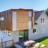
The Shorter Residence, located in Wenatchee, WA, by Pb Elemental Architecture is actually an addition to a 1906 apple orchard farm house.
The original farm house had already been renovated in a modern, minimalist style so the addition — comprising a master suite and living room — needed to match that same style. Designed to be a refuge for the couple and their newborn, the master suite has a cozy fireplace and a balcony with beautiful views. The exterior materials include corten standing seam, polycarbonate, cement fiber panels and cedar rainscreen siding.


BK on 09.20.2011 at 13:29 PM
Wow – this house does not work at all for me. It’s the ugliest house you have ever posted here! And I like ugly houses!
That addition is a monstrosity – it makes the historic house look like a joke. None of the exterior materials make sense to me.
The 2 other houses you posted by Pb Elemental Architecture are great!
http://design-milk.com/mt-baker-residence-seattle-by-pb-elemental-architecture/
http://design-milk.com/phinney-modern-by-pb-elemental-architecture/
but they are not glued onto the side of a tiny cottage….
Jaime (post author) on 09.20.2011 at 14:00 PM
I like the juxtaposition of the two parts of the home. I think it’s interesting that they don’t match.
BK on 09.20.2011 at 18:25 PM
I get that – I agree that the juxtaposition is interesting.
I am not sure why it does not work for me. To me, the 2 buildings don’t relate to each other in a satisfying way.
Thanks for posting this
mgrummer on 09.20.2011 at 20:16 PM
Jaime,
I’m curious to know what you find Juxtaposing about this addition. I don’t find the form, materials and methods to be juxtaposed at all, rather they kind of meld together at a blurred merge-point like a unhealthy growth. It’s not to my liking at all. This doesn’t speak minimalist update to existing farmhouse in any way that is worthwhile.
It is also weird that this appears to be located in some crappy builder-developer suburban style development tract.
We don’t have many great old barns worth keeping in the americas, but in europe there are some amazing modern renov’s of barns. One in belgium comes to mind that was completely enclosed from the inside, off-setting the exterior wall about 4 feet from the existing perimeter wall, with a glass and steel structure. It can be found in a couple of european architecture books, but I know the photographer and there’s a few pics on his website: http://www.tvdv.be/galleries/architecture/ Look in the seventh row, third column.
It is becoming trendy for old warehouses and factories in the U.S. and Canada to create some similar architecture as we see in that belgium farmhouse.
mgrummer on 09.22.2011 at 12:29 PM
Tim pointed me to a dedicated page on his site for this project called Boerderij Lennik and is by Giuseppe Farris.
Here’s the architectural photography gallery page: http://www.tvdv.be/features/aaarevisedhouse/
And the Architect’s website: http://www.farris.it/(Select: WORKS>PRIVATE HOUSING>BOERDERIJ LENNIK)
Much more juxtaposition of material and methods in this project, thought juxtaposed form is surely lacking. Which I’m totally fine with, I hope the next century architecture become less about overall form and more about the form of architectural elements.
Jaime (post author) on 09.22.2011 at 12:35 PM
That’s a great project – thanks for sharing. I simply think that this particular project was of interest because the two parts of the home balanced like Jekyll and Hyde. Whether some people think that it’s harmonious or quite the opposite is up to individual taste. Majority seems to be the latter.
Zaedrus on 09.20.2011 at 13:33 PM
Change the roofline of the original and then this is a winner.
plumbat on 09.20.2011 at 22:17 PM
Looks like the old house has grown a tumor
jim guthrie on 09.21.2011 at 08:19 AM
that’s horrible.
Zach on 09.21.2011 at 18:08 PM
That is one of the ugliest houses I’ve ever seen. Didn’t they plan anything before they started?
Ann on 01.11.2012 at 13:54 PM
That’s ugly. Looks like the house has a tumor.