


For the second year in a row, materials company Baars & Bloemhoff challenged six different designers to dramatically rethink ordinary “unsexy” decorative materials and create something that’s beautiful and inspiring. Launching at this year’s Dutch Design Week, Transitions II features different materials from Baars & Bloemhoff’s product spectrum, reimagined.
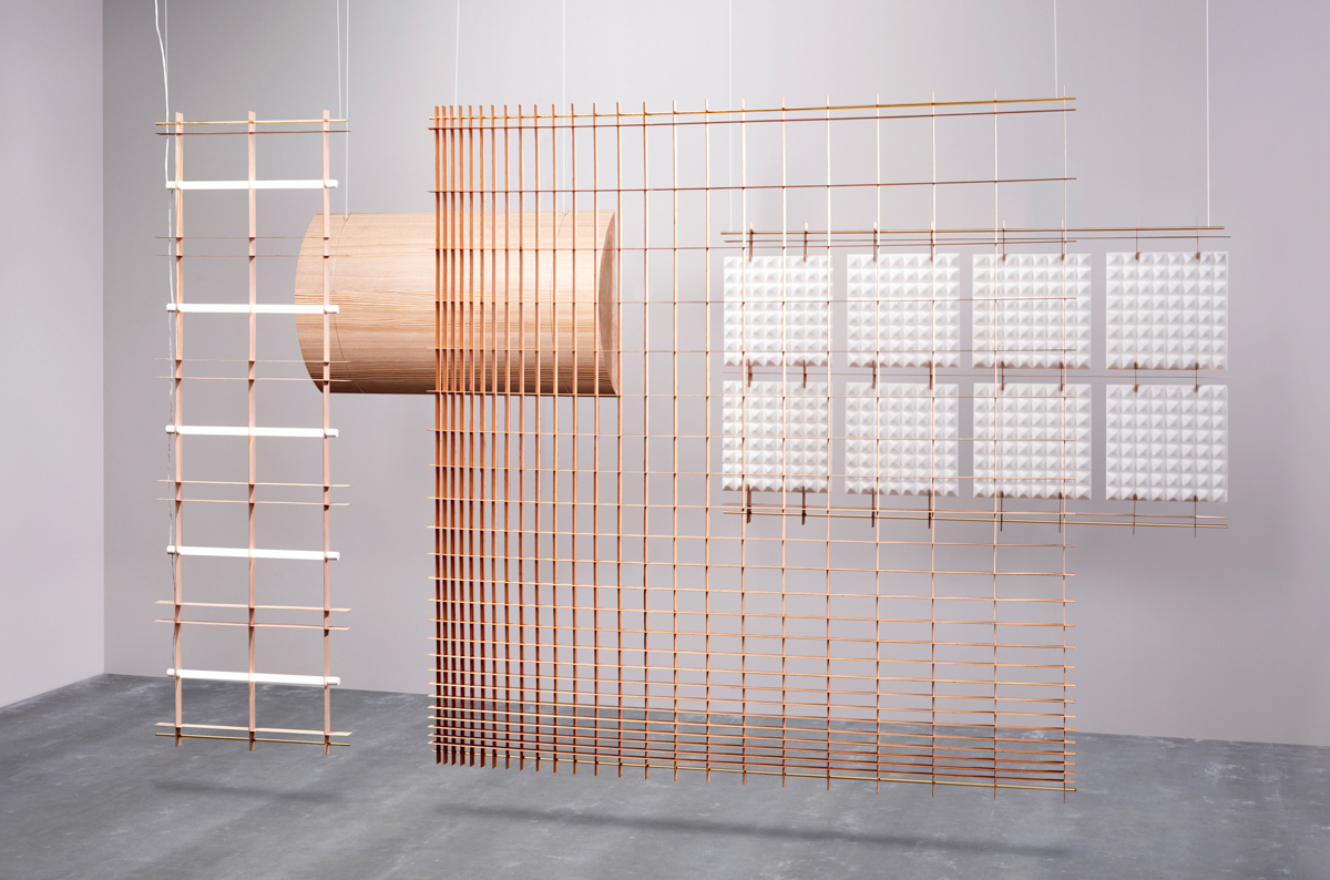
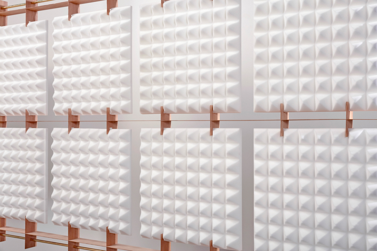
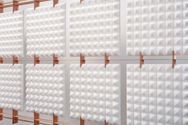
Using the wood veneer from Baars & Bloemhoff’s Shinnoki collection, designer David Derksen created a minimalist set of space dividers that are light and strong. Not only do they serve to parse out a room, they can also hold various design elements, such as LED lamps or even acoustic foam.


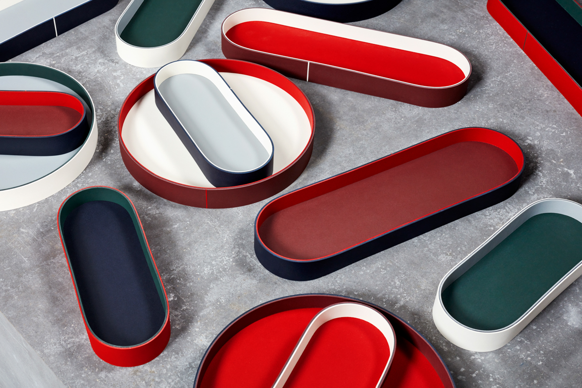
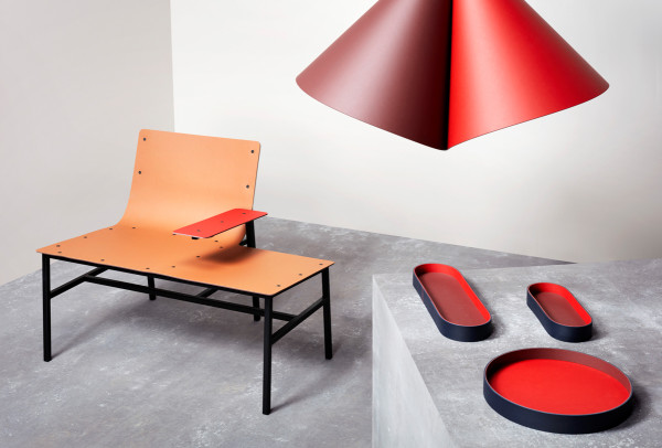
Daphna Laurens focused on everything but the desktop. The duo went above and beyond to test the limits of the material they used. They took layers from the Forbo Desktop, which is essentially linoleum, and glued them together, creating a flexible material that’s double-sided and two different colors. Following the same technique, they created organizers, a chair, and a lamp that act as accessories for the desk.

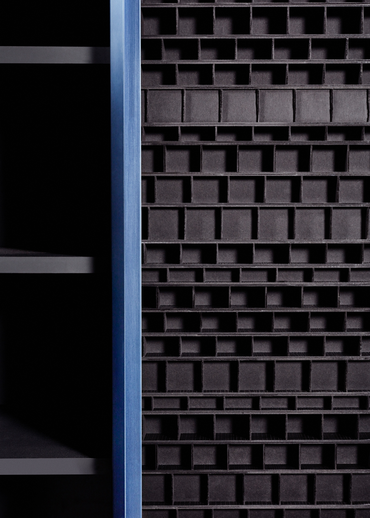
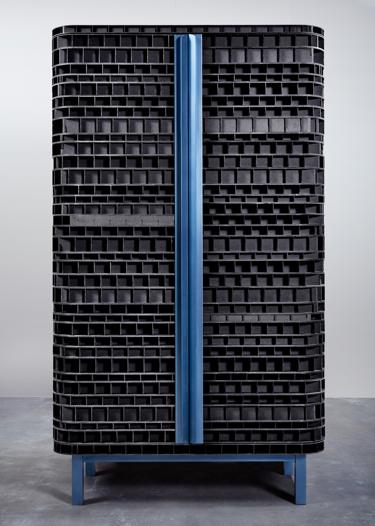
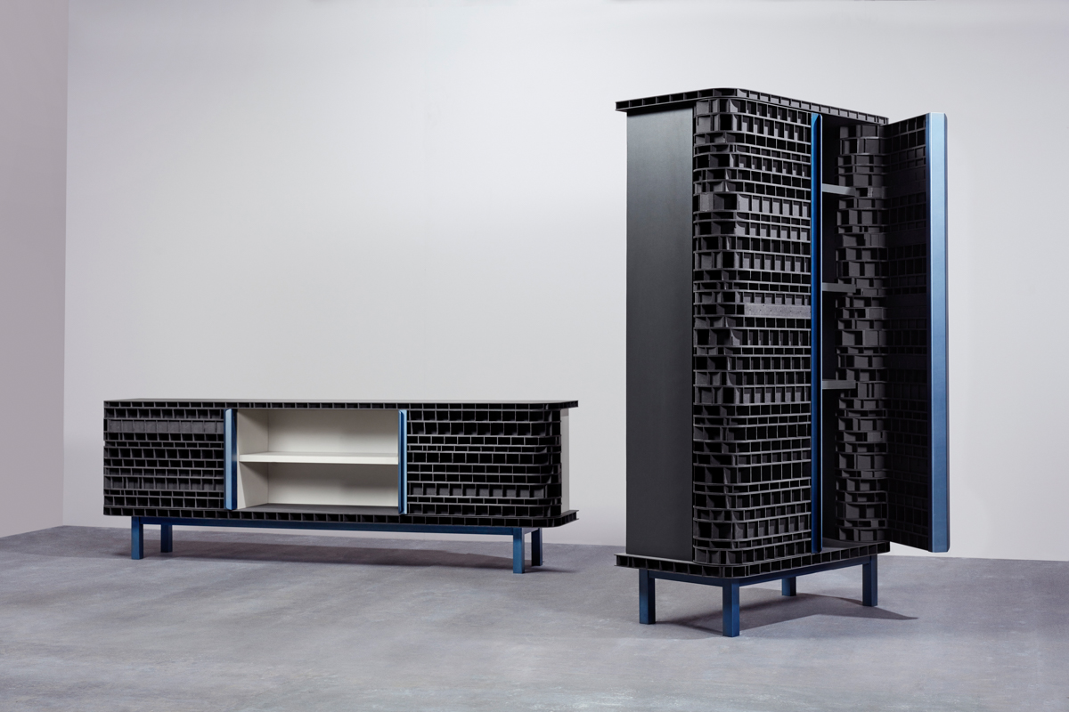
With Inside-Out, Klaas Kuiken created a cupboard and dresser that highlight inner beauty. He used the Finsa Greenpanel material, which at first glance, looks rather nondescript. However, when you break it open, you see that there is a unique, hidden beauty that lies within. This cupboard dresser duo echoes this hidden aesthetic.


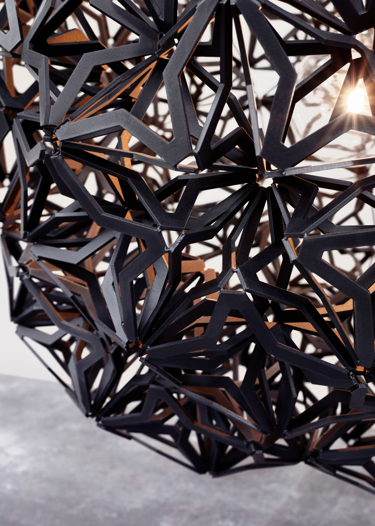
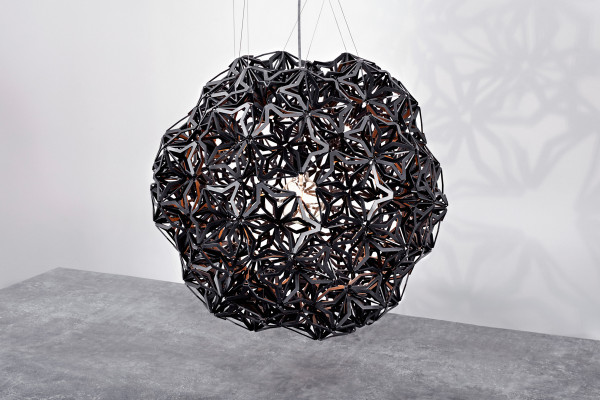
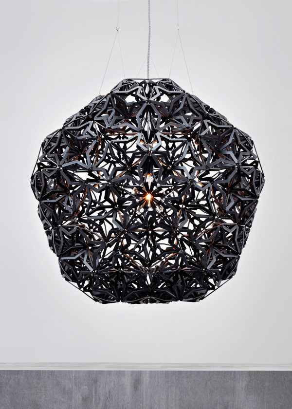
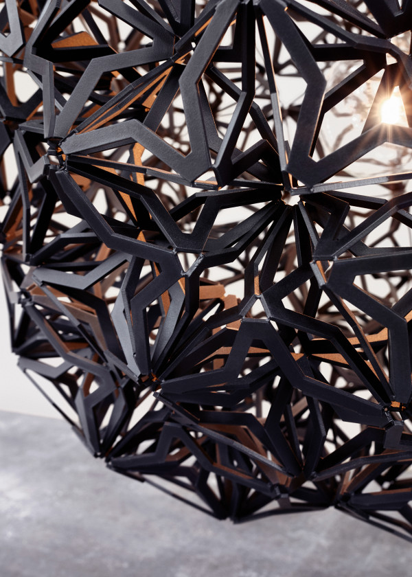
Paul Heijnen chose the Finsa Color MDF material to create the stunning Unity Globe Light that’s made of 1,080 individual, identical units. Based on the shape of a dodecahedron, the light is complex and layered by hand, and results in almost no residual waste.
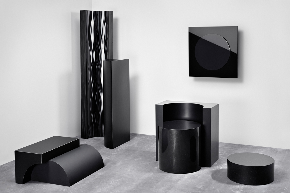
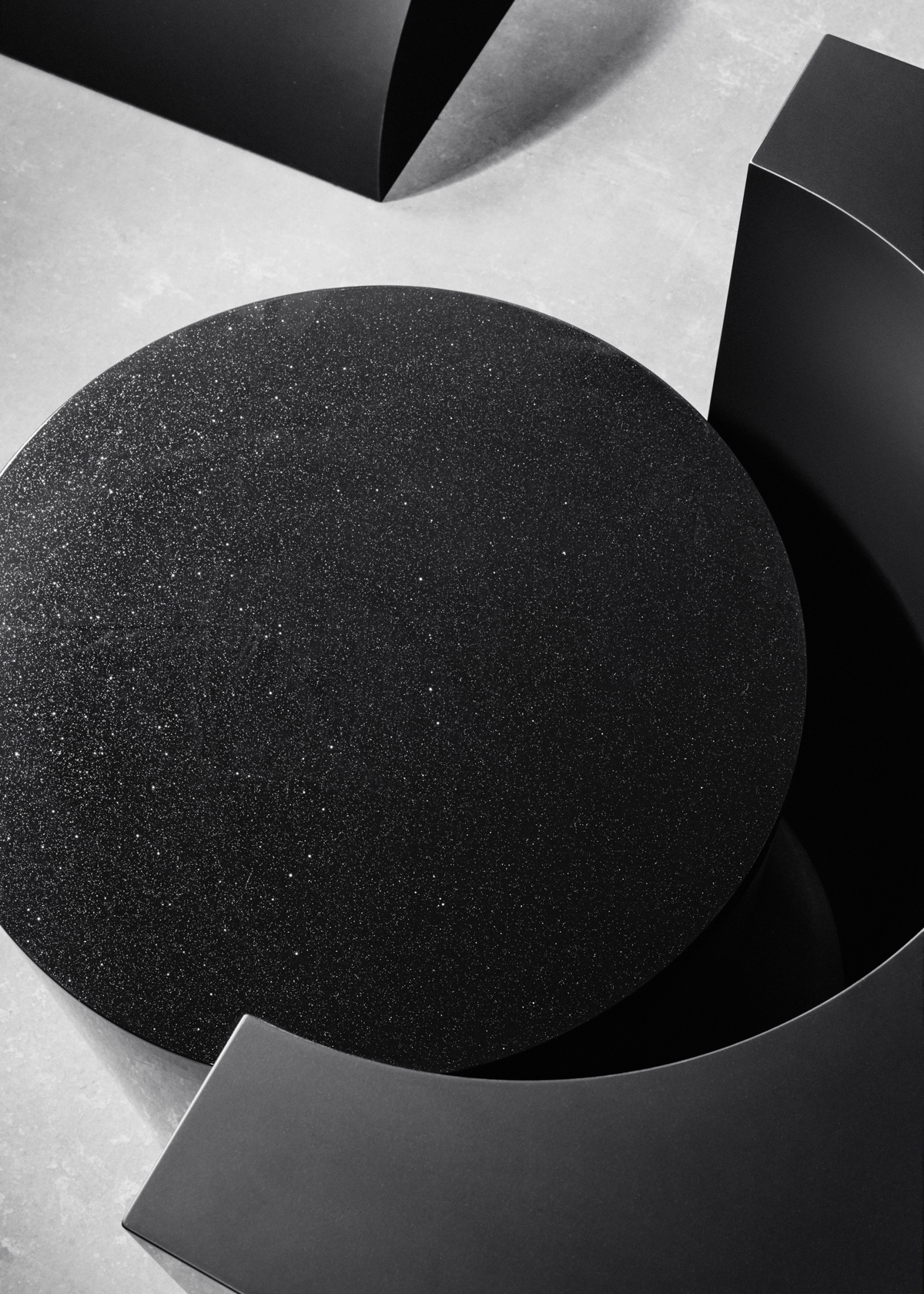
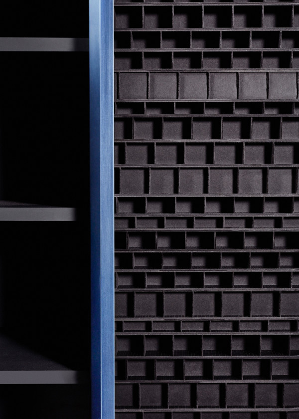
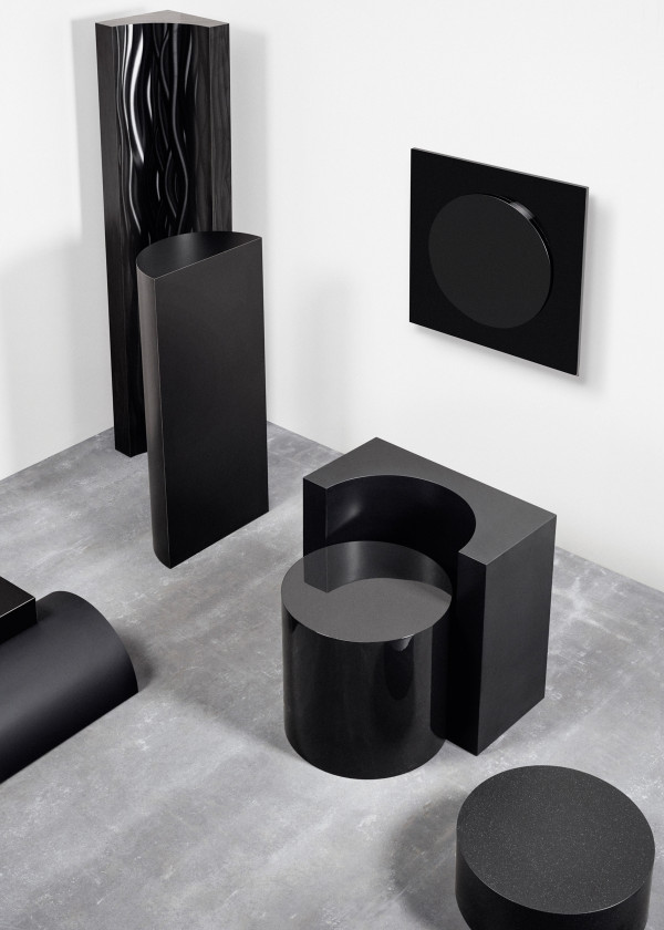
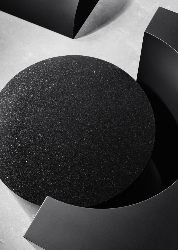
Intrigued by the interaction of material, color, and form, Studio rENs took a huge range of black materials from the Baars & Bloemhoff selection to create a set of modular objects. These building blocks can be combined depending on the user’s desires, and allow freedom between material and form.

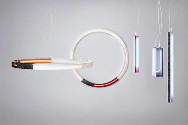
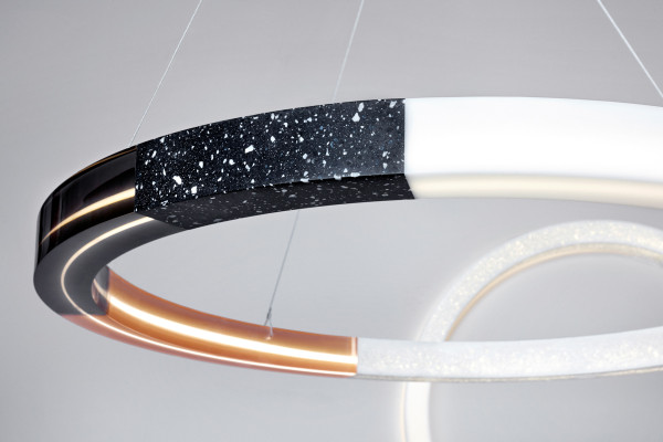
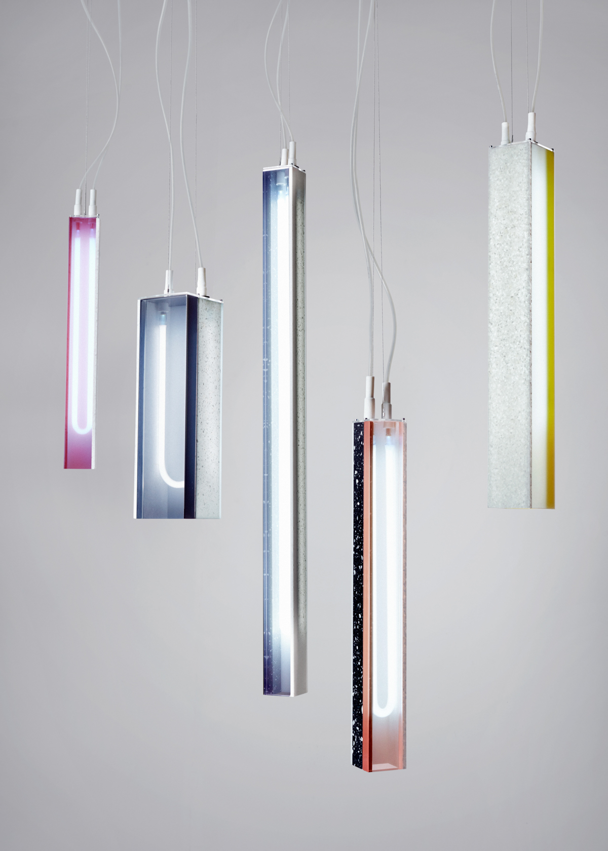
FILTER is a series of lights that well, play with the filtering of light, by Sabine Marcelis. Quickly fasincated by Baars & Bloemhoff’s surface material HI-MACS, she experimented with the material, playing with thickness and texture. Finally, she illuminated it and combined the HI-MACS with cast resin in different colors, resulting in FILTER.