
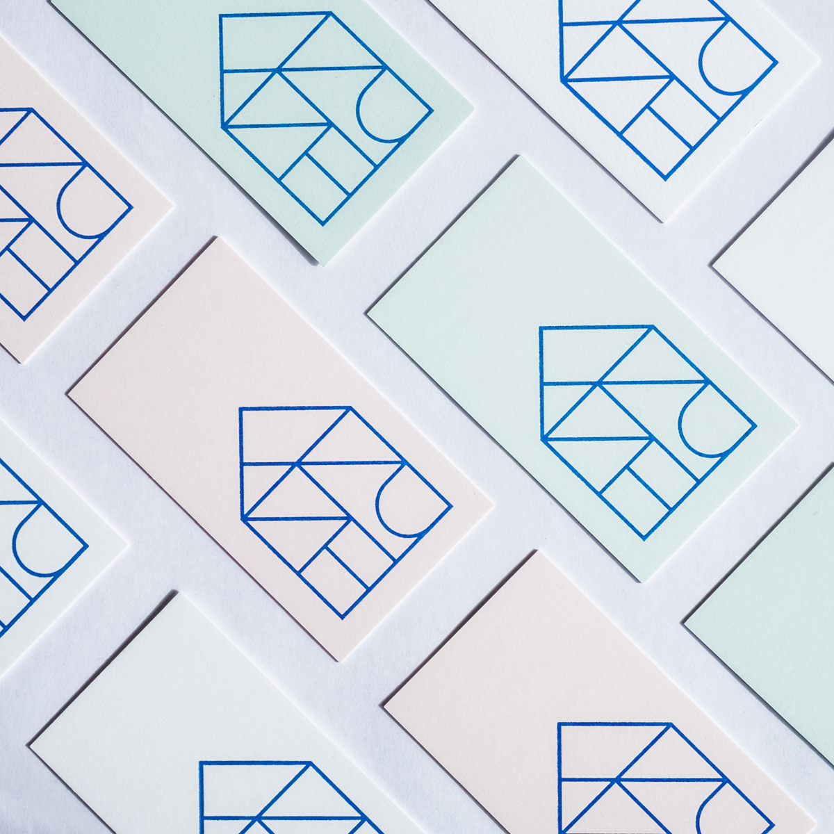

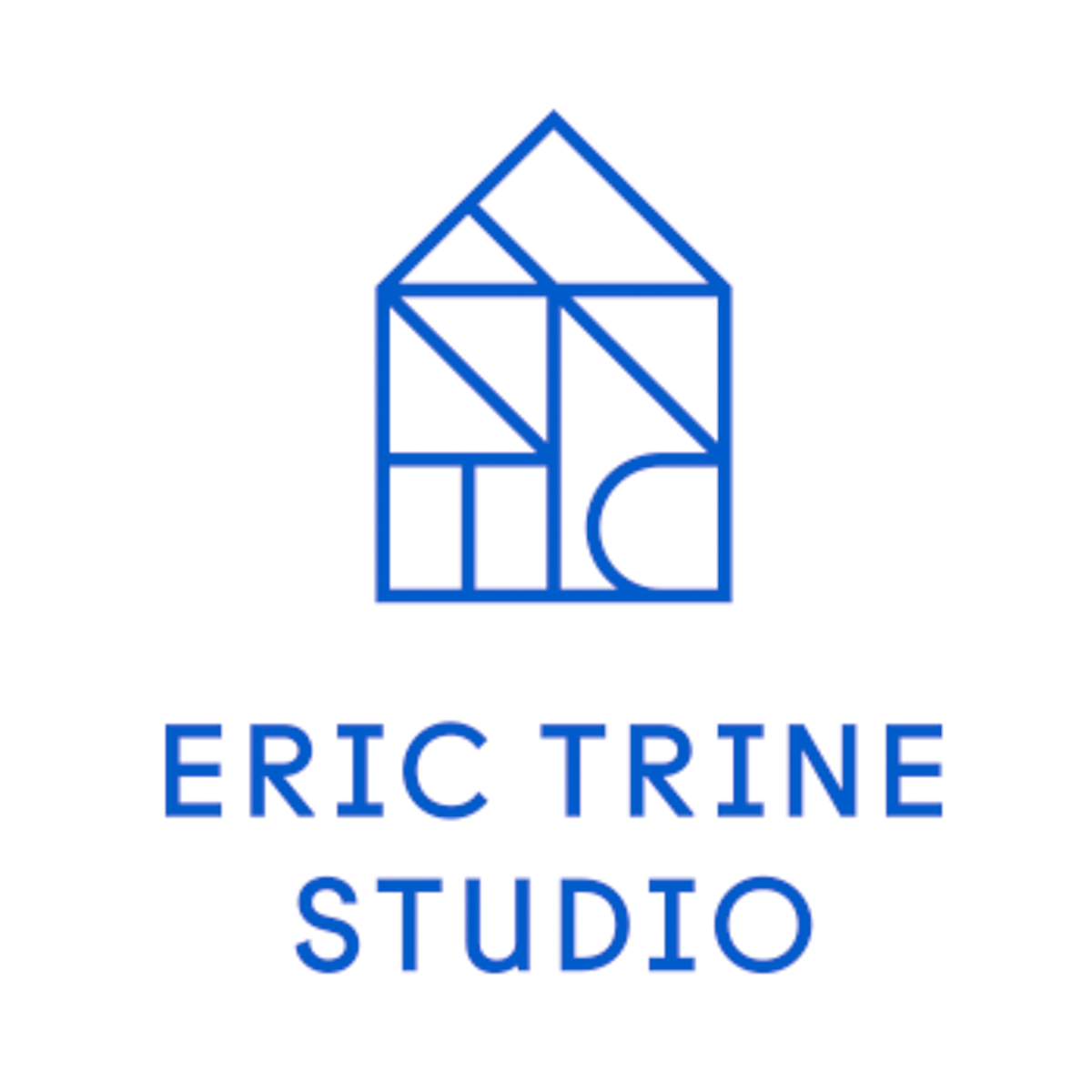


That’s the way designer and artist Eric Trine describes his work. Recently, he recruited design studio Civilization to help with a rebrand, and challenged them to create a mark/logo that answers the question.
Eric is best known for a variety of casual, playful product designs, and his work has shown up anywhere and everywhere, from IDSwest to The Land of Nod. Thus, the mark had to be one that not only represented his work now, but also could grow with him.

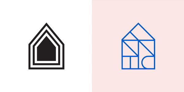
Before and after
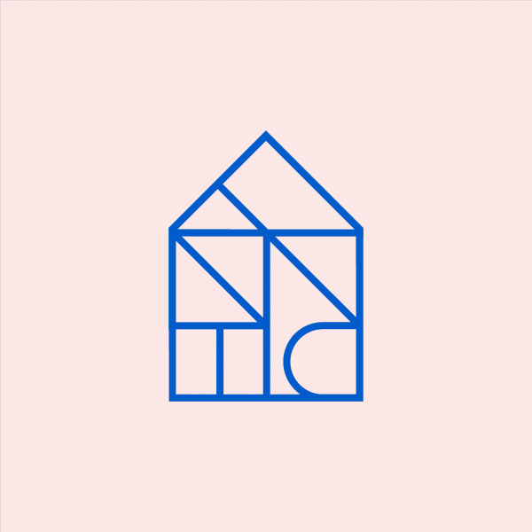
Trine emphasized early on that the concept of “house” was important to him—the bulk of what he designs resides in homes. He also shared that one of his dreams is to design a playground. Taking that, Civilization studied vintage playground equipment and took inspiration of their shapes, curves, and colors.
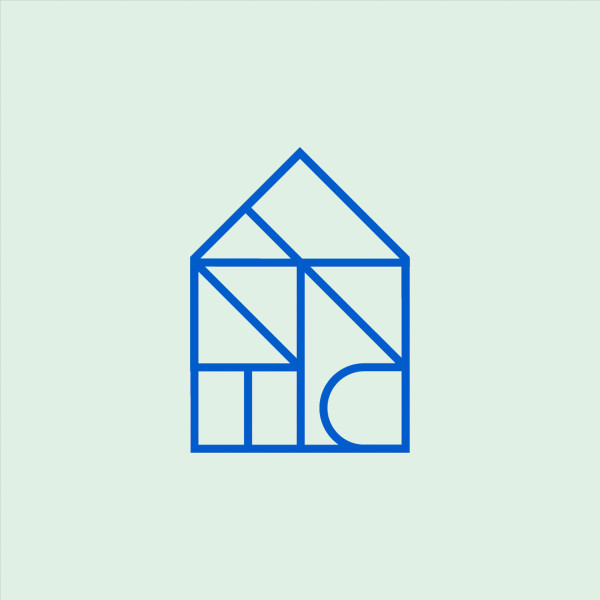
The resulting product is a mark that has the shape of a home that houses a hidden monogram, spelling the letters of Trine. Curved, rounded letters in a bold blue were laid against pastel pink and green, which are signature colors from Eric’s collection and also give it a west coast feel.

![]()
Check out Eric’s collection at The Land of Nod:
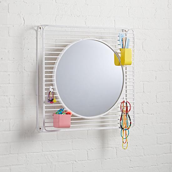
Linea Wall Mirror
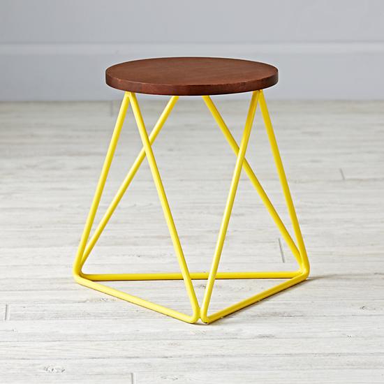
Linear Stool

Linear Book Cart