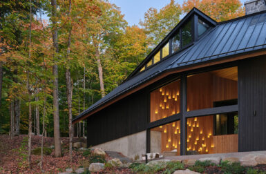
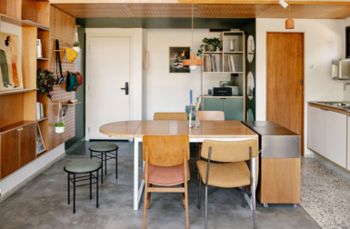


The carefully chosen, rich hues that Ottawa-based architect Paul Kariouk uses in his work make quite an impact, though the actual number of colors is fairly limited. An aqua-tinged navy paired with an almost neon orange, bar red against the forest greens, and acid pink and green are all inspiring pairs. For CMYLK, using the Colourlovers palette tool, we picked those out, and then filled in the blanks with the neutrals.
Above: Hammam steam room in Ottawa, Canada

Hill-Maheux Cottage in Quebec, Canada

Condo in Ottawa, Canada