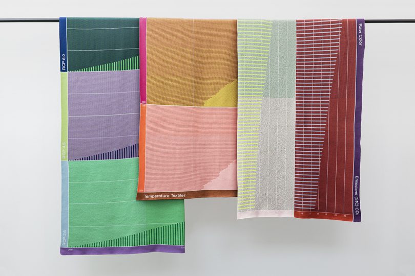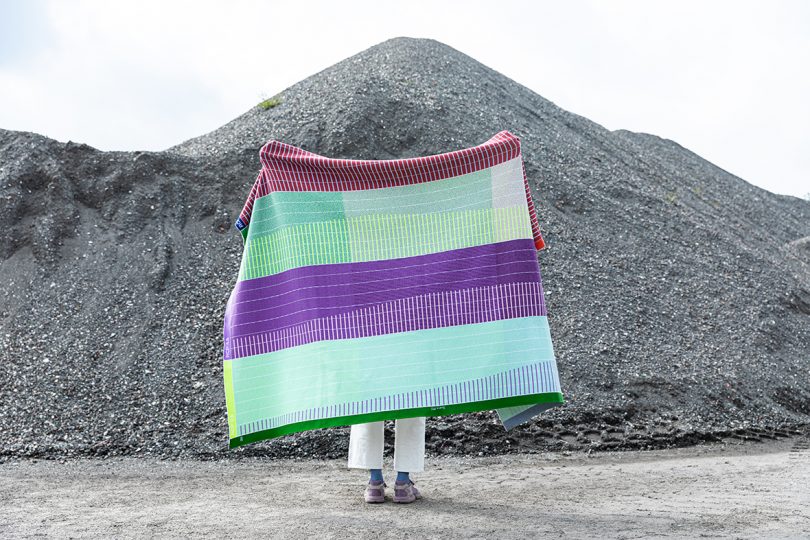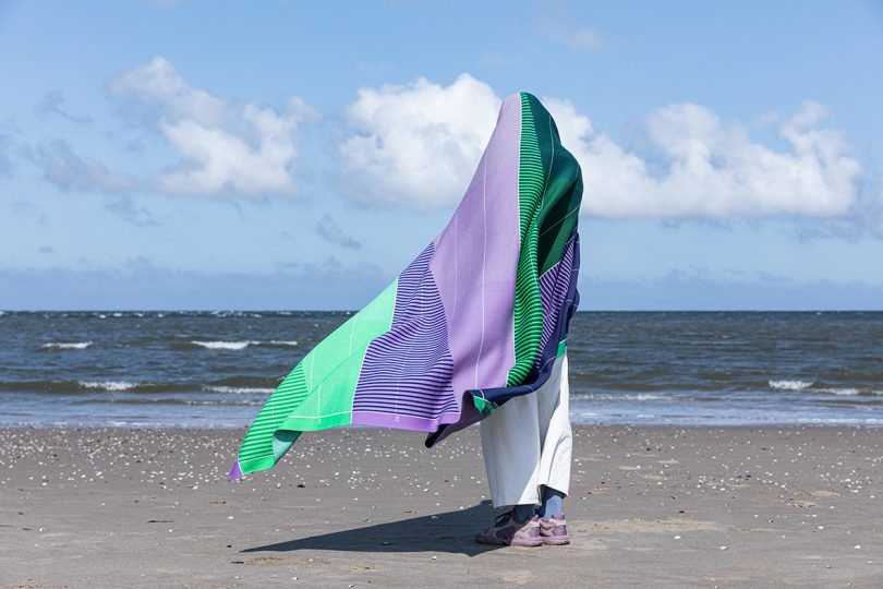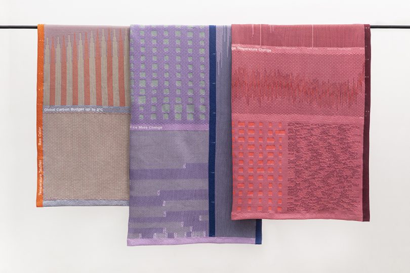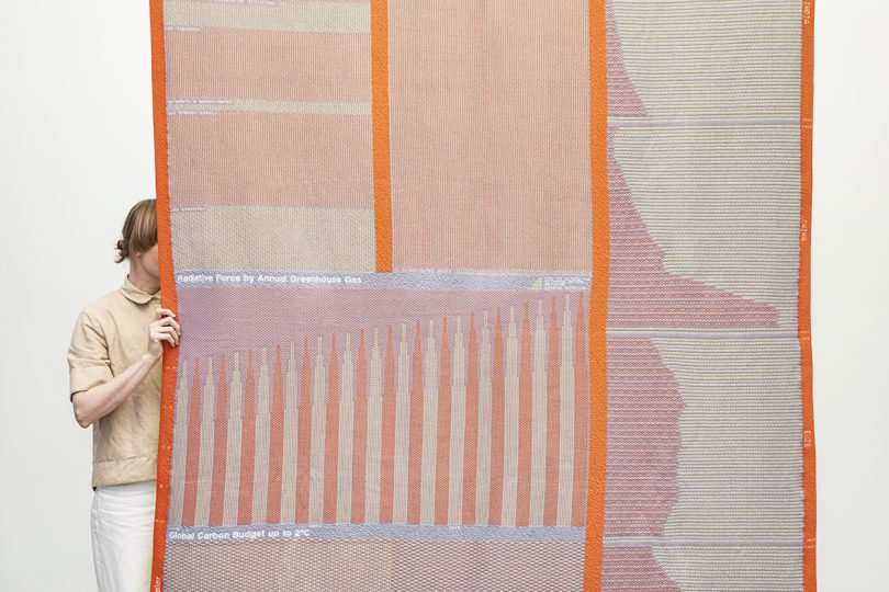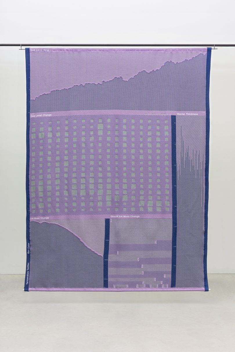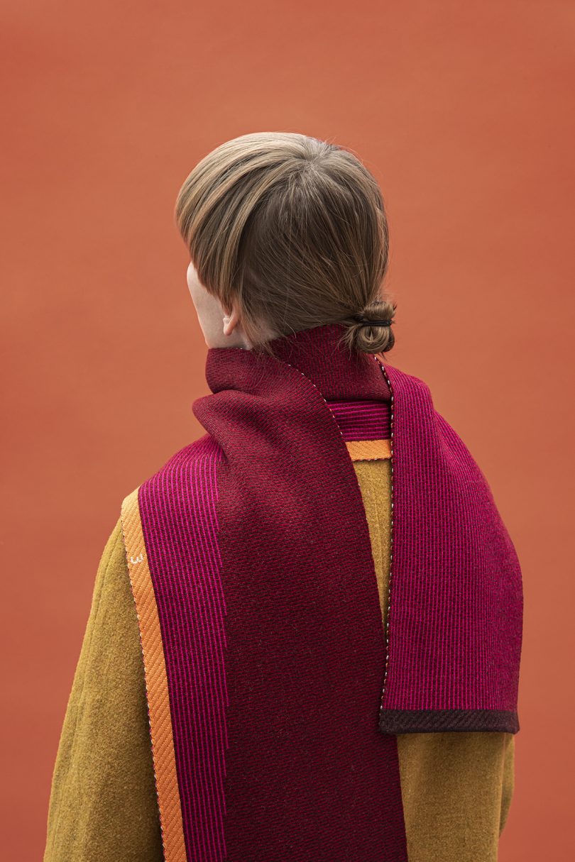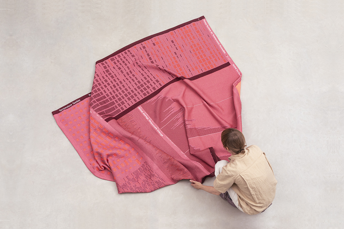
Climate change is more at the forefront of the world’s struggles than ever before, and Raw Color has created a way to visually and aesthetically share the data with Temperature Textiles. The line is meant to distill this important information down to its essence, then turn it on its head by providing warmth to the user. Temperature Textiles’ products range from knitted blankets to scarves and socks, carrying climate data with them.
Three data groups are represented within the line: temperature change, sea level rise, and emission – the most relevant drivers and causes of climate change. Data sets that Raw Color uses range from collected information of the past to modeled predictions of the future. They’ve collaborated with experts, such as KNMI, for their data input. On the textile side, they teamed up with TextielLab, among others.
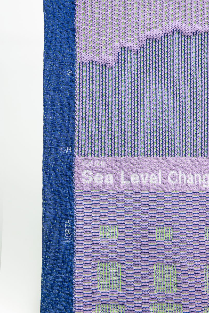
Knitting reduces waste thanks to its ‘made to measure’ ability. Raw Color decided on a curated color scheme, focusing on the communication value of each color group. A selection of warm shades are applied on Temperature Change, cool tones are used on Sea Level Rise, and a mix of warm and cool hues are combined on Emission.
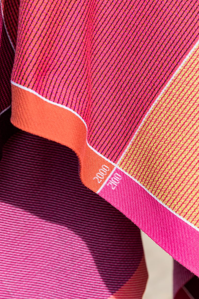
The patterns of Temperature Textiles’ flat knit blankets are based on four emission scenario predictions modeled by IPCC (Intergovernmental Panel on Climate Change). Each line represents one year that shows the temperature, sea level, and emission rise from 2000 until 2100.
The patterns and graphics of each double knit blanket look to related data. For example, data shows that Global Warming varies in intensity depending on the region, or it shows the Global Carbon Budget. Double knitting allows the creation of two layers of fabric at the same time. The layers can be interlocked together to create subtle height differences and embossing effects.
The horizontal lines on Temperature Textiles’ Sea Level Socks visualize the predicted rise in water. Similar to a ruler, the four strong lines represent the rise of 7cm in 2020, 12cm in 2030, 17cm in 2040, and 22 cm in 2050. These numbers are based on the most ideal emission scenario (RCP 2.8) according to the Paris Climate Agreement. The data is pulled from the climate report of IPCC.
On the Temperature Scarf, the vertical pink lines represent the predicted Surface Temperature Change in degrees Celsius of even years from 2000 until 2100. The orange surface indicates 0 – 4ºC. The diagram shows that the temperature might reach 4ºC by 2100, in case of the least ideal scenario (RCP 8.5) if no emission reduction occurs, according to the Paris Climate Agreement. Again, this data is based on the climate report of IPCC.
To learn more about Temperature Textiles, visit temperaturetextiles.nl.

