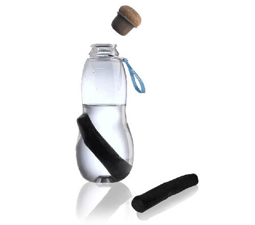
From their studio in the heart of London, Black + Blum designers Dan Black and Martin Blum create products for the home and office, combining ruthless practicality with an intellectually-satisfying design aesthetic meant to charm and entertain. In this month’s Deconstruction, the duo provides us with a detailed look into the development of the Eau Good water bottle, which incorporates active charcoal to purify the water.
They told us, “We were aware that by creating a water bottle, we had a chance to combat the environmental impact that bottled water has on the planet. Over 22 billion plastic water bottles are discarded around the world every year. We wanted a design which encouraged people to drink tap water and stop buying bottled water.”
The initial brief was to design a water bottle to add to the lunchbox range. Designing a water bottle is a very wide brief. And there is no shortage of products on the market. Therefore, it was important that this water bottle have a story and a strong something that would make it stand out.

Our first ideas were based loosely around the aesthetic of the army/camping style water canteen. We felt the outdoor/vintage/functional aesthetic would give the water bottle a cool utilitarian look. This is also why we used a cork stopper rather than a standard threaded top. The sound of cork being pulled out of a bottle has an almost romantic, thirst-quenching allure. It definitely differentiates the bottle from others on the market.
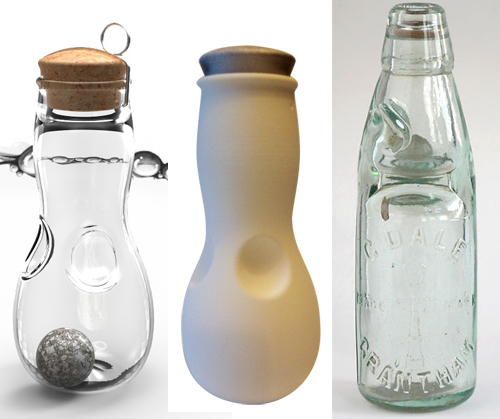
We were also influenced by antique Victorian glass spirit bottles. These elevate the value of the liquid within. We thought this might make people subconsciously appreciate the value of water held within. We quickly understood that clear water bottles look best when full of water thanks to the refraction of light. We took this into consideration as we explored various shapes.

Initial sketches reveal the variety of shapes we explored.

We knew that there were already filter water bottles on the market, and that their appeal lay in the promise of making tap water taste better. However, these filters had a drawback: the charcoal used was hidden from view within a plastic encasement. This did not fit with the utilitarian look we were after, so we decided to explore a way to expose the charcoal filter.
This is when we came across Binchotan charcoal, which the Japanese have been using to purify water since the 17th century. Martin Blum’s wife is Japanese, so she helped us lean more about it. The more we learned about Binchotan charcoal, the more we realized we had to find a way to incorporate it into our design. Binchotan charcoal is active carbon, which removes chlorine, balances the PH, and adds minerals to the water. Simply put, it makes tap water taste delicious.

We made a rapid prototype to test the holding concept, and realized that although the bottle would not deform the way we wanted it to. With the shape in this image, the walls creased when squeezed and the area which held the charcoal did not move enough to release it. So it was back to the drawing board.
This movie shows the new shape working on a rapid prototype model. This is a true example of function dictating the form. In order to get the bottle to deform correctly and release and hold the charcoal, we had to work around this shape.

We began to develop the shape of the bottle with little experience of blow molding restrictions; later that we found that some of our ideas were not possible.
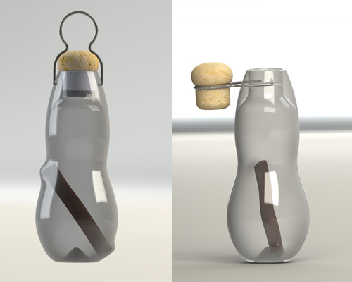
We explored different ways to use the wire clamp. One, as the bottle’s handle, and two, as a mechanism that would hold the cork when not in the bottle.
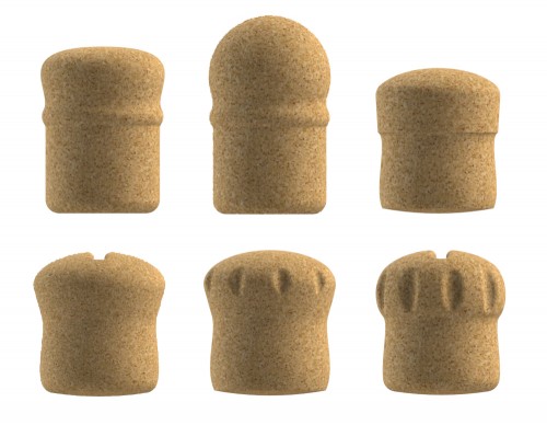
We found a highly skilled cork factory and explored different shapes that would fit with the bottle and metal.

This is the final shape. The top of the bottle is not how we initially intended it to be, but we had to work within the limitations of blow molding. We have added a fabric tag that one can use to help to pull open the metal ring, and also to hold the bottle.
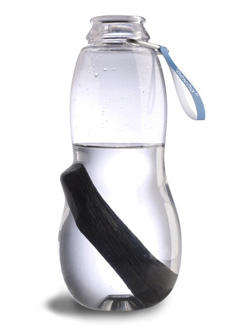
The final, beautiful bottle, filled with water.

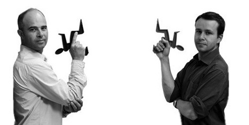
For the packaging, we wanted to show someone drinking from the bottle. Here are Martin and Dan using the bottles.

The packaging was a massive challenge. We needed to show off the bottle so people could touch it, but we also had to explain the Binchotan charcoal, since most people would not be familiar with it. This image shows the outline of the packaging. The cardboard can be folded out to make an actual box, so that someone can gift wrap it or send it out for mail order.

The front graphics of the packaging.

The back wall of the packaging, which gives more information about how the bottle and charcoal work.
