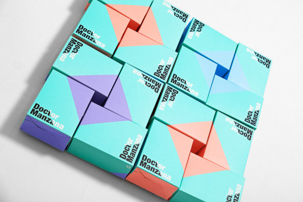
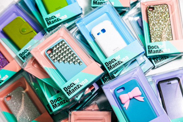
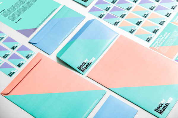
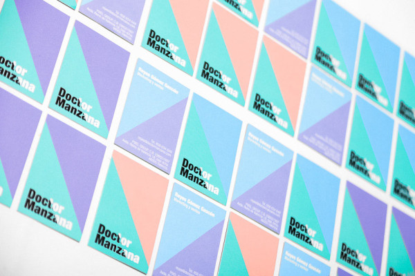
Doctor Manzana is a retail shop selling gadgets for mobile devices, while also offering technical services for smartphones and tablets. The business brought in Ana Milena Hernández Palacios, of Masquespacio, to redesign the branding for their storefront in Valencia, Spain, and the results are a catchy and memorable graphic identity that will grow with the brand.
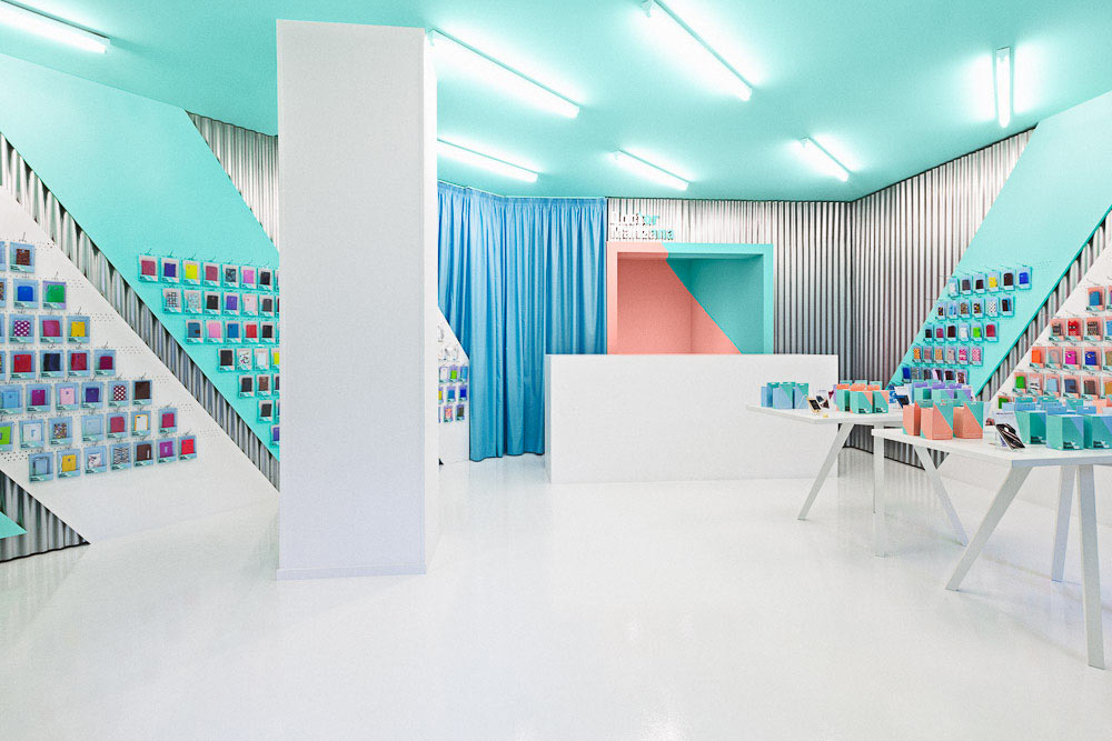
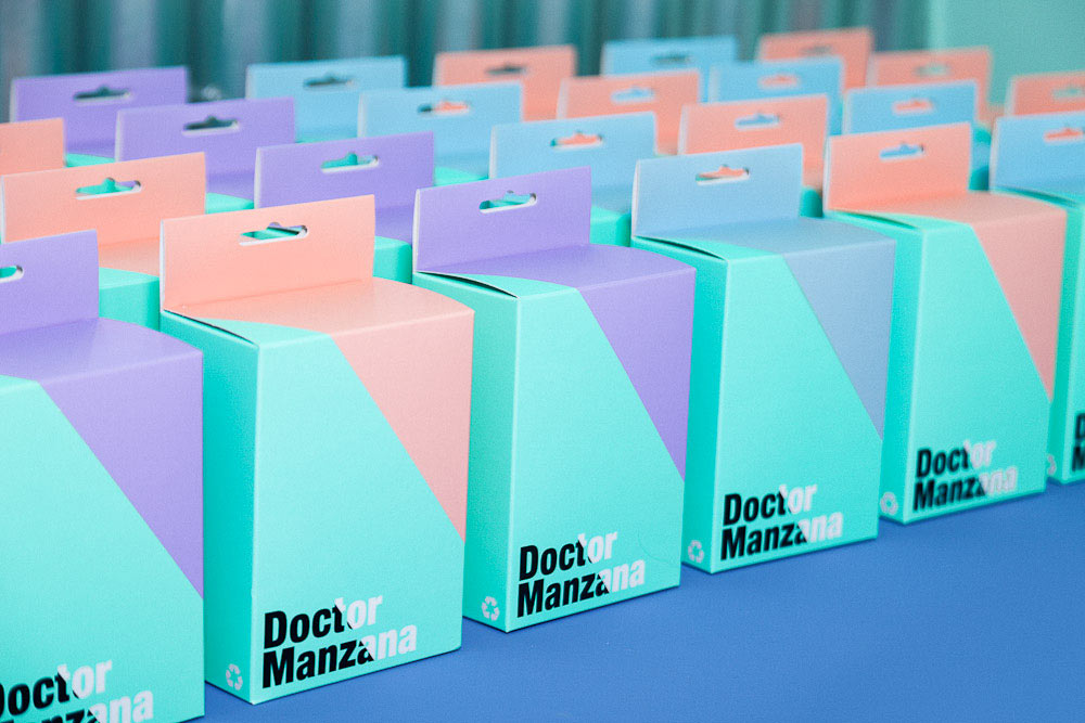
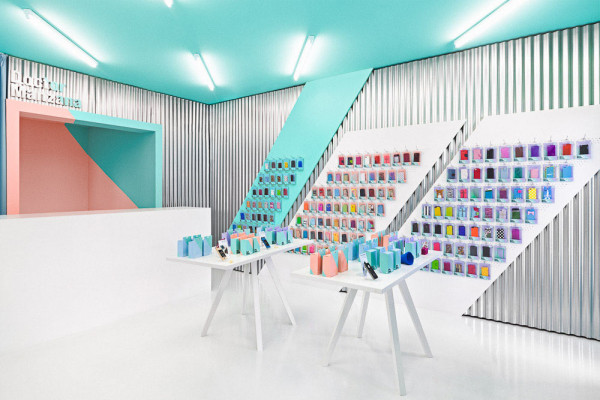
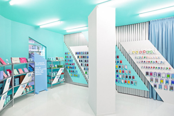
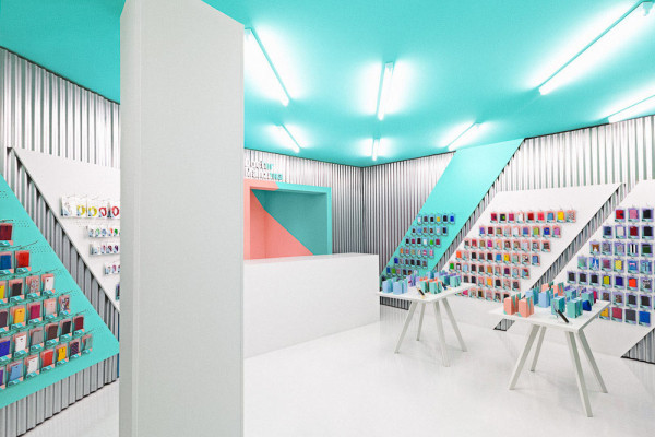
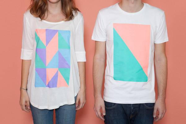
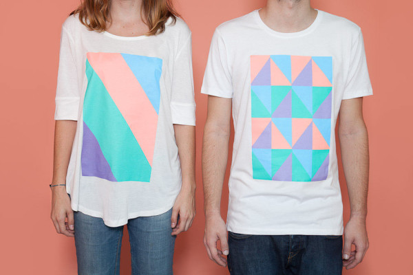
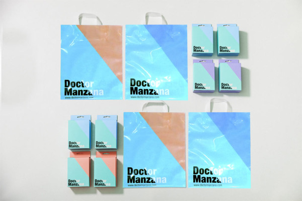
Once just an online company offering technical services, the brand’s great success led them to the idea of opening a brick and mortar store. Throughout the identity, you’ll notice 54 degree angles which references the reflection of a touchscreen. The angles continue on the walls, the packaging, displays, and even the way the lighting is hung on the ceiling.
The colors were inspired by the name of the brand, which includes “doctor”, so they based the concept on a hospital. Eliminating a conventional design, what was left was the color scheme of blues and greens.
The blue curtains are a nod to hospitals.
Galvanized metal is used to bring a bit of an industrial look to the space.
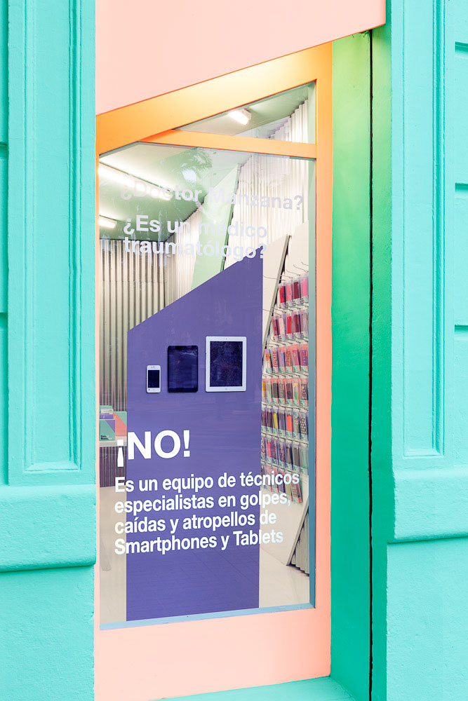
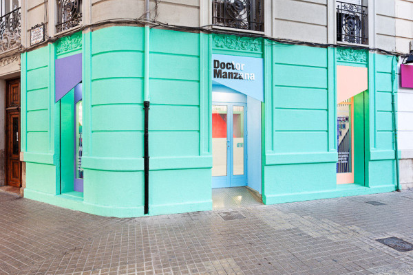
The striking identity begins with the façade, which incorporates the same angles and the blue and green colors of a doctor’s scrubs, along with mixing in, “the salmon color for the fashionistas and the purple for the freaks.”
Photos by David Rodríguez.
