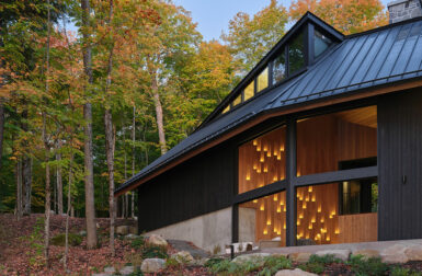
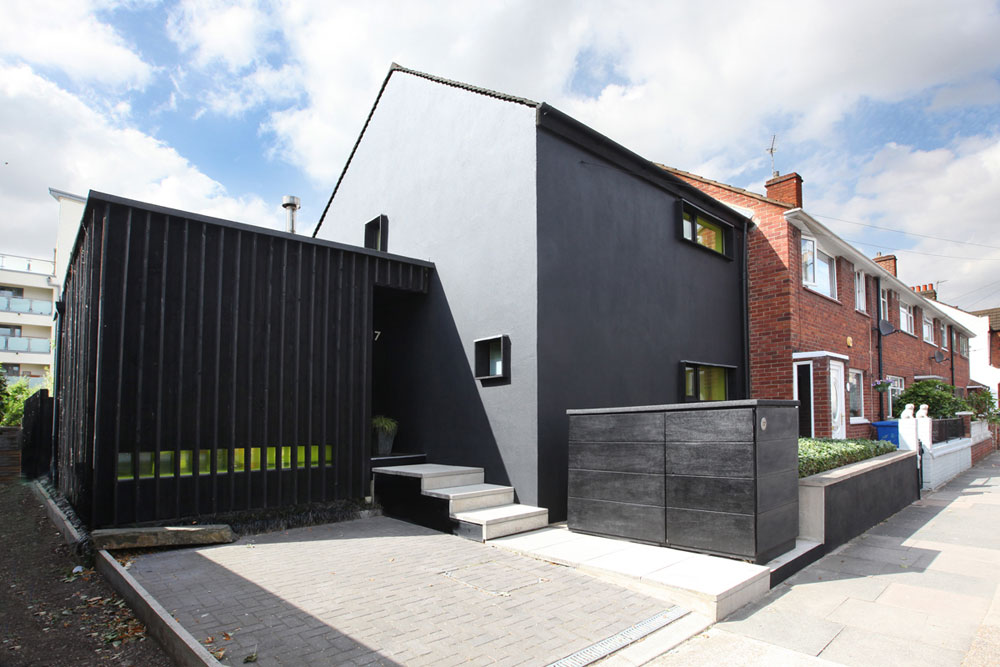


Interior Architect Magnus Scholz and his partner Creative Director Aubrey Laret, of M+A London, purchased a 1950s end unit council house in Nunhead, South East London, and set about renovating it for modern times. It wasn’t just the interior of Seventeen that got a revival, the original brick exterior got a makeover as well.

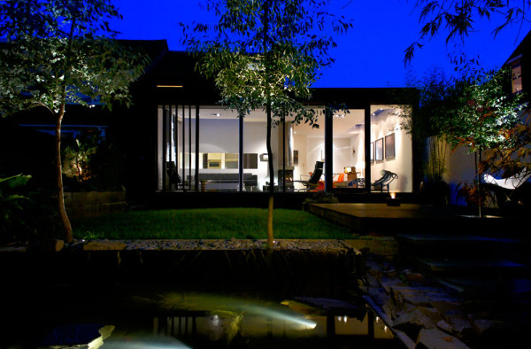
The front door was bricked over and the road-facing windows were changed out for elongated landscape ones. The façade went to a bold black and the roof was replaced with flat grey cement shingles. All the darkness is offset with acid yellow glazing over the windows, and the ivy, of course.

The overall footprint was expanded on the side and rear of the house turning it into an L-shaped structure, doubling the size of the original house.
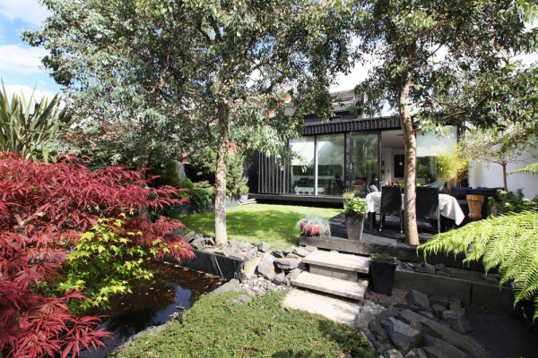
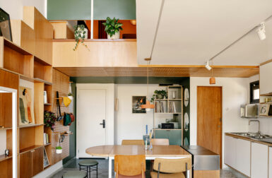
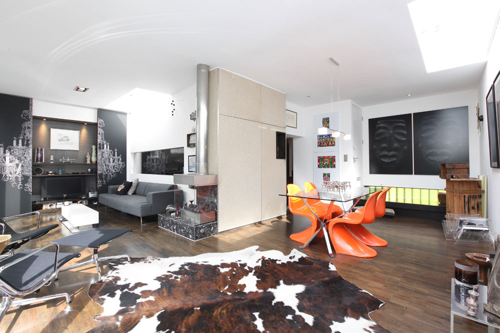
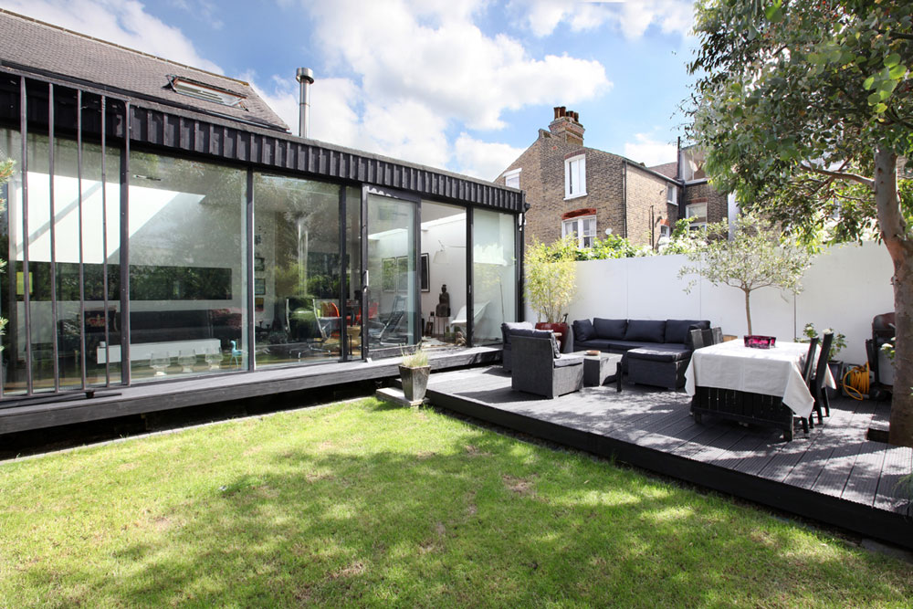
The transformation on the interior was just as radical. The public living spaces were moved to face and open up to the garden in the back. The open plan layout gives way to white walls and high ceilings, paired with warm wood floors.

Love that clever moving wall used to hide the TV.

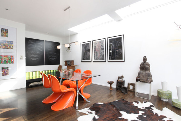


The new open galley kitchen is made up of the old kitchen and part of the old living room. A large horizontal window connects the space to the living while also allowing light from the backyard to flood in.

Old stones that were discovered in the garden from the original Victorian villa that stood there were reused at the bottom of the staircase and as a step at the entrance.

The floors are reclaimed from an old sugar factory that once stood in Surrey Quays. Each piece of parquet had to be individually cleaned by hand before it could be installed.
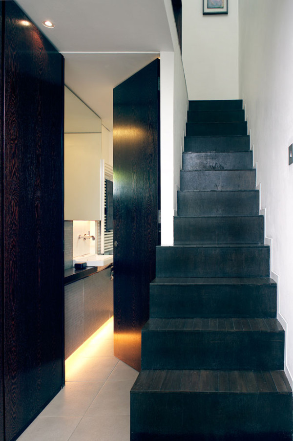

The ceiling was removed at the top of the stairwell that leads to the upstairs bedroom, revealing a triple height space with a window that floods the stairs with light.

All of the walls were removed upstairs and freestanding cabinets were installed to form an open bedroom and dressing room.


Photos by Paul Scannell and Thierry Cardineau.