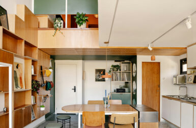
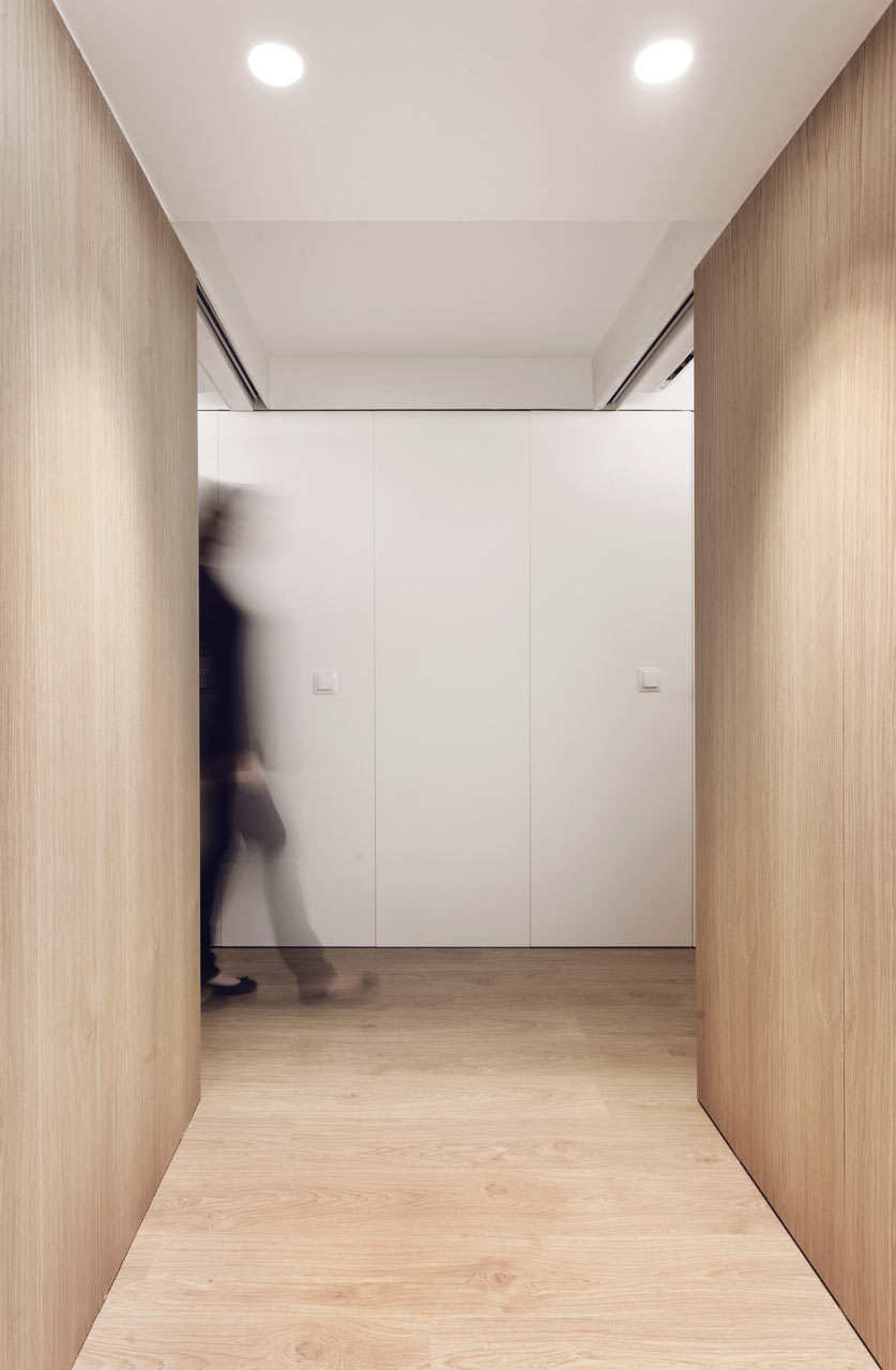
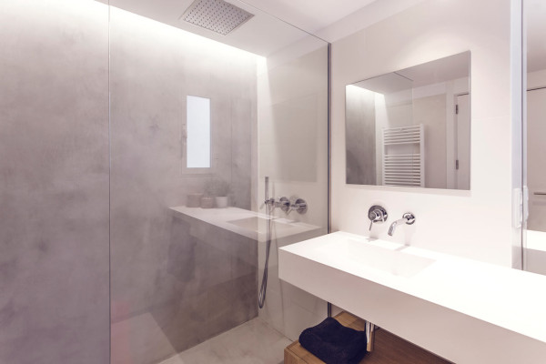
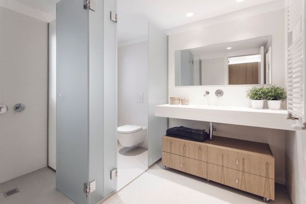
Spanish studio onside took on the refurbishment and interior design of the GM Apartment in the El Ensanche district of Valencia, Spain. Designed for a family of five, the project had to address their storage and circulation issues, as well as too many dark spaces with no natural ventilation. The result is a spacious, light-filled apartment decked out in pure white and warm wood tones.
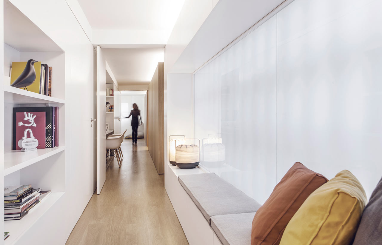
In the hallway, they were able to add a long seating bench for reading, along with plenty of storage.
The minimalist kitchen boasts white cabinets and countertops on the island and one side of the kitchen, while the other has floor-to-ceiling wood cabinets surrounding the wall ovens.
A hidden light system keeps the spaces bright without visually cluttering the ceiling.
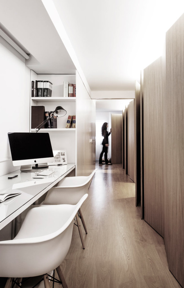
A workspace was built into the hallway which can also be closed off for privacy.
Along the opposite wall, there’s built-in storage.
Photos by Alfonso Calza.

5 Comments
Bill Fester on 05.26.2015 at 15:50 PM
I’m perplexed with why this apartment is so great. Ok, so I suspect someone COULD want the same two tones (wood/ white) through their whole domicile, but isn’t that a bit dull?
The Hallway Seat. Looks too narrow to actual sit on, lay down on, let alone get comfortable and read a book. Who would use that other than a horizontal surface that you park tons of “stuff” on?
The Kitchen. Here’s a smallish apartment, but as far as kitchen appliance/ utility efficiency, it might as well be a mansion. Sink to stove to oven ( I don’t know where the fridge is), would be a cook’s nightmare.
The desk with the wood back face. I can’t think of a more solitary sort of confinement. The white fiberglass chairs look uncomfortable from the start (no cushions I guess).
I can’t even think the woman on the beanbag chair looks all that comfortable, talking on the phone while she appears to be sliding down in a heap on the floor. Puleez!
Believe me, you folks do a fantastic job highlighting some of the most awesome and incredible architecture and interiors. This one here just doesn’t make the cut.
Best regards,
Bill
Mark on 05.26.2015 at 17:55 PM
I totally agree with you Bill. I am a fan of clean lines and I particularly like wood+white combination, however, there is something very strange with this apartment. The reason i say strange is that they went too sterile with the overall look and probably figured they could add warmth via the wood tones but there is no life whatsoever in the apartment. There is a fine balance between form over function and this place does not accomplish that. It is austere in a dystopian kind of way that i would never want to experience in person.
Add some warmth+texture via small bursts of color and textiles somewhere and you’ll start to make this a bit more human, but i agree the furniture itself and layout of the place may take more work to cross into the habitable category.
Betty Wasserman Art & Interiors on 05.27.2015 at 13:36 PM
Love the wood tones and the light over the dining room table. It’s really beautiful.
Deborah on 05.27.2015 at 13:53 PM
Love the bean bag chair – who is it made by?
Sam on 05.27.2015 at 16:59 PM
Too much white and too much wood. And as usual, no floor plan.
Want your image to appear next to your comment? Get a gravatar!Leave A Comment