


There’s undoubtedly a lot under the hood of OS X Yosemite, Apple’s upcoming desktop operating system announced this past Monday morning during Apple’s 2014 Worldwide Developers Conference. But it will be the cleaner, flatter, and noticeably translucent refreshed front face of OS X Yosemite, which will present users the impression Apple is serious about modernizing the Mac UI in parallel with the iOS experience.

Gone are most any remnants of Apple’s skeuomorphic past which held steadfast with previous OS X releases. Instead, the previewed release of OS X 10.10 exhibits many of the aesthetic hallmarks of its mobile iOS sibling, iOS 7.
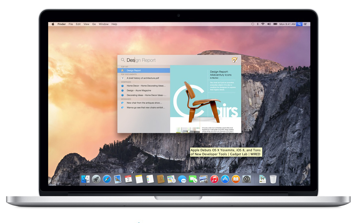
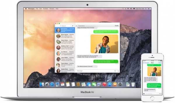
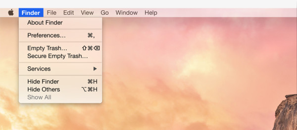
Starting from the updated flat 2D dock, to the elimination of gradients, the redesigned red, yellow, and green “stoplights” in the corner of every app window, with sharper edges throughout the interface, OS X Yosemite is indicative of Apple’s intent to make the transition between accessing information from an iPhone, iPad, or Mac computer as seamless as possible, with desktop applications like Safari looking and operating more like their mobile equivalents, and accessed images, websites, or documents live updated across all OS X+iOS 8 connected devices.
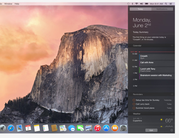
Taking a cue from iOS 7, user defined backgrounds directly affect the color temperature of application windows, and a new “dark mode” dims out distractions by darkening menu bars from light to dark gray. A dark translucent background for the Notification Center aids legibility and makes OS X’s brightly colored iconographic elements “pop” better than before.
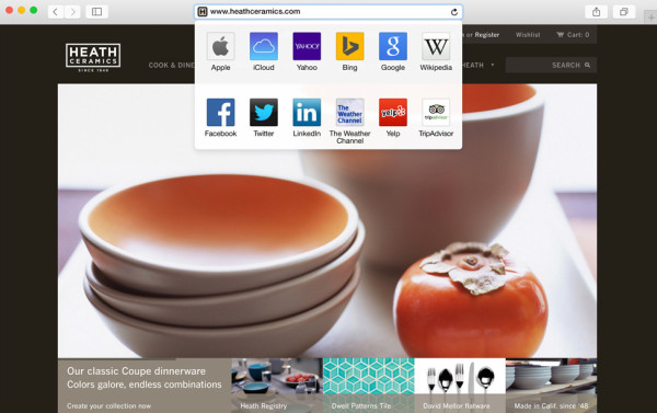
The updated Safari is so minimalist, the browser’s toolbar now only displays the truncated originating source address instead of the whole URL. Whether this proves popular – or even acceptable – is yet to be seen, but it’s obvious Apple believes the average user doesn’t care so much about the “address” as the “house” visited online.
Apple has left no stone unturned, even optimizing system fonts for clarity for Retina displays, though the choice of Helvetica Neue is being greeted with concern in regards to legibility.
Individually these many interface design changes seem minor, but in total the redesign presented by Apple with OS X Yosemite is a strong indicator the Cupertino company believes mobile computing now dictates the “how”, “where”, “what” and “when” in a way previously unthinkable before the emergence of the iPhone and iPad.
Apple is giving developers access to OS X 10.10 Yosemite starting Monday with a public beta available later this summer, and a final public release this fall as a free upgrade. A full outline of all of Apple’s OS X Yosemite features is available at Apple.com.