
We all know PANTONE as being the #1 authority of all things color in the design industry and now they’ve released a new collection of real skin colors in their new PANTONE SkinTone Guide.

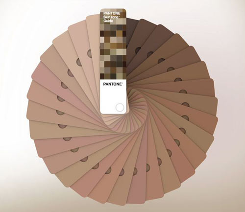
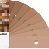
The new guide was based off of “more than 1,000 human skin measurements” which lead to the 110 shades in the new library. Each large-sized swatch has perforation to allow for easy visual matching.

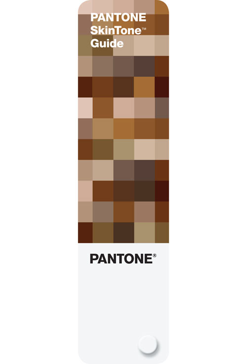
Each color is assigned a four-digit PANTONE number where the first two reference the “hue or undertone of the skin” and the last two reflect the “tone or lightness and darkness of the skin.”
This reminds us of Brazilian artist Angelica Dass’ Humanæ PANTONE/skin-matching project - check that one out.


stephanie on 11.06.2012 at 14:30 PM
French artist Pierre David has done a similar project some time ago, it’s called Le Nuancier:
http://www.pierredavid.net/?_p=plasticien_nuancier
http://www.thecoolist.com/the-human-pantone-by-pierre-david/
Jen on 11.07.2012 at 16:08 PM
And again, a skin palette that does not go pale enough or dark enough for many of my friends :-/
Oragon on 11.08.2012 at 14:33 PM
They mustn’t talk to many Internerds. Don’t know about you guys but my flesh is almost white.
Joel on 11.09.2012 at 07:43 AM
I’m pretty sure they had something like this in Germany in 1936
Devon Photographer on 11.10.2012 at 17:49 PM
‘PANTONE Essex Orange’ appears to be missing :)
Say on 03.24.2013 at 11:40 AM
and there is only the palette of the skin? I would like a palette of nature. ^_^