
Until PANTONE’s announcement of last year’s color of the year for 2010 — 15-5519 Turquoise — I had no idea how powerful this declaration would really be. Every magazine, blog and website was littered with turquoise, blue-green, teal and any shade bearing the slightest resemblance to turquoise.
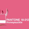
PANTONE continues its fashion and home decor domination by declaring 2011’s color…
wait for it…

Energizing Honeysuckle lifts spirits and imparts confidence to meet life’s ongoing challenges.
A Color for All Seasons. Courageous. Confident. Vital. A brave new color, for a brave new world. Let the bold spirit of Honeysuckle infuse you, lift you and carry you through the year. It’s a color for every day — with nothing “everyday” about it.
This reddish, pinkish, salmonish color will dominate the internerd for the next 12 months. Are you ready?
Within 20 minutes of this declaration on Thursday, my inbox was flooded with pink-colored gift ideas, roundups and submissions. It was like a Pepto-Bismol explosion in my inbox. That being said, I actually like this color but am afraid that PANTONE’s influence may flood the market so much so that I might get sick of it very quickly.
What do you think? Love it or hate it? Care or don’t care? Will you be using it in any of your projects?