
Wim Crouwel – A Graphic Odyssey opens on March 30, 2011 at The Design Museum. The exhibition, a celebration of the Dutch graphic designer Wim Crouwel’s career, will feature his work for design practice “Total Design,” the identity for the Stedelijk Museum, Amsterdam, as well as his iconic poster, print, typography and lesser known exhibition design.

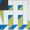
Crouwel’s work embraced a new modernity, producing typographic designs that captured the essence of the emerging computer and space age of the early 1960s. The exhibition will also highlight Crouwel’s rigorous design approach exploring his innovative use of grid-based layouts and typographic systems to produce consistently striking asymmetric visuals.


More about Wim Crouwel from the press release:
Born in 1928, Wim Crouwel studied fine art in Groningen before moving to Amsterdam in the early 1950s where he initially worked for an exhibition design company. Heavily influenced by architecture, Crouwel’s sense of spatial awareness and identity led to commissions for cultural institutions, most notably in 1956 for the Van Abbe Museum in Eindhoven. Commissions for the Stedelijk Museum in Amsterdam followed leading to Crouwel taking sole responsibility for the museum’s identity, posters and catalogues. Whilst at the Stedelijk, Crouwel developed his unique grid system which acted as a museum template for its graphic identity, an approach which realised a visual consistency for the museum and in doing so defined a turning point for the world of graphic design.
The dawn of the space age and computer technology throughout the 60s encouraged new approaches and possibilities for typeface design. Embracing the mood of modernity, Crouwel designed a radical ‘New Alphabet’ typeface, especially for the use in emerging computer systems. The ‘New Alphabet’ designed in 1967 appeared almost alien, a cipher script of vertical and horizontal lines. This Illegible font challenged the design establishment and provoked debate, a debate which Crouwel was happy to engage and openly admitted to placing visual aesthetics above function. The ‘New Alphabet’ was redrawn by Brett Wickens and Peter Saville for the Joy Division album, ‘Substance’ in the late 80s and then digitized and made available for use in 1997 by The Foundry. Crouwel designed a number of other fonts including Gridnick, an appropriate reference to his use of grid systems and Mr. Gridnick became Crouwel’s endearing nickname.
In 1963 Crouwel founded the multi-disciplinary design agency ‘Total Design’ creating the identity for numerous Dutch companies. Together with the founding partners, Crouwel shaped the visual landscape of the Netherlands throughout the 60’s and 70’s, working for clients such as IBM, and typeface commissions for Olivetti. In the 1970s Crouwel designed the Dutch Pavilion for the Osaka World Fair, as well as numerous postal stamps for the Dutch post office and a controversial redesign of the telephone book using only lowercase letters.
The exhibition will also have original sketches, posters, catalogues and archive photography with films and audio commentary. Six designers will take inspiration from Crouwel’s career to produce a series of limited edition prints, a unique Wim Crouwel inspired wallpaper will also be sold exclusively in the Design Museum Shop.
Londoners, I think this is definitely one to stop by and check out.
What: Wim Crouwel – A Graphic Odyssey
When: March 30, 2011 – July 3, 2011
Where: The Design Museum, Shad Thames, London SE1 2YD 020 7403 6933 UK