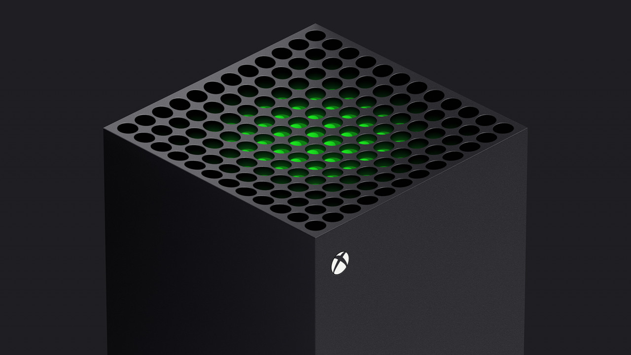
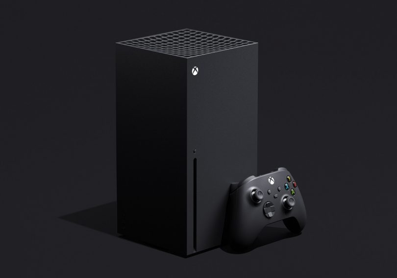
When Microsoft’s Xbox gaming hardware division began to eke out information about their next generation consoles ahead of their official early November 2020 launch, it would not be the muscular hardware specs list that would prove surprising. Microsoft – and their rival Sony – had previewed a considerable amount of detail ahead of the impending arrival of their next generation consoles, to a degree gamers mostly knew what to expect. But the industrial design of the Xbox Series S, and more specifically the monolithic Xbox Series X, would each arrive to reveal a radical departure sporting a reductive design that seemed to owe more to Dieter Rams than any other gaming console before it.
With Nintendo taking a playful and family-friendly route, and Sony applying a hyper-angular futuristic appliqué to their Playstation 5, these Xbox consoles stand out with minimalist and modern silhouettes – basic geometry permitting a great range of placement that neither competitors’ solutions inspire.
The simplicity of the Series X and Series S seem to share the design DNA of the Braun RT 20 radio and L2 speaker.
We spoke with Chris Kujawski, the Principal Designer for Xbox Consoles about how these designs came to fruition and what each design reveals about Microsoft’s vision about the current and future state of gaming.
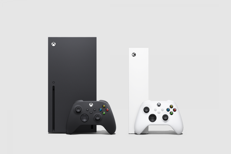
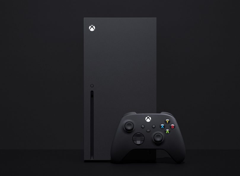
Unlike the Xbox Series S, which shares some of the recognizable DNA and a silhouette similar to past Xbox consoles, the matte black Series X seems to obfuscate rather than openly communicate its purpose as a gaming machine. What was the design philosophy behind its simple monolithic case compared to other consoles?
We know that our fans buy consoles for one reason – to play games. We also know they live with this hardware for years. We designed both Xbox Series X and Xbox Series S to have their own distinct personalities and character, but also to disappear into the background when they’re not being used. We consciously walk the line between expressive and subdued.
The Xbox Series X almost meets a 2:1 ratio in regard to its height vs width. Was this intentional or a case where function dictated form to help dissipate heat?
We were intentional about that choice, and the truth is it was some of both. With the Xbox Series X, the team had to rethink the rules of console design in order to efficiently cool the internal components. As a result, the team split the motherboard in half to move a huge amount of air through the entire system at a low enough acoustic level to keep the console running quietly and efficiently.
It is the size of the fan that set the footprint of the device; the team then worked the proportion of the enclosure around the other major components to achieve that 2:1 ratio of two cubes stacked, which became the basis for the pure, geometric identity of both consoles. This is where engineering and design work together to achieve balance in not only performance, but also in form. With the product footprint anchored by a single coaxial fan, we optimized the height to achieve a near 2:1 proportionality.
Both Xbox consoles are characterized by a simple geometric monochromatic design, with each console’s grill – one square, the other a circle – operating as a focal point. How was the pattern and size of these grills determined?
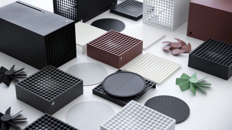
One of our primary design principles was to let the expression of form be driven by functional elements, which is really the basis of our “Intelligent Geometry” approach to design – starting with pure building blocks and letting the functionality of the device create character by revealing itself through details. In terms of designing the venting systems on both Xbox Series S and Xbox Series X, the scale and number of vent holes was driven by the functional requirement of free area ratio (FAR).
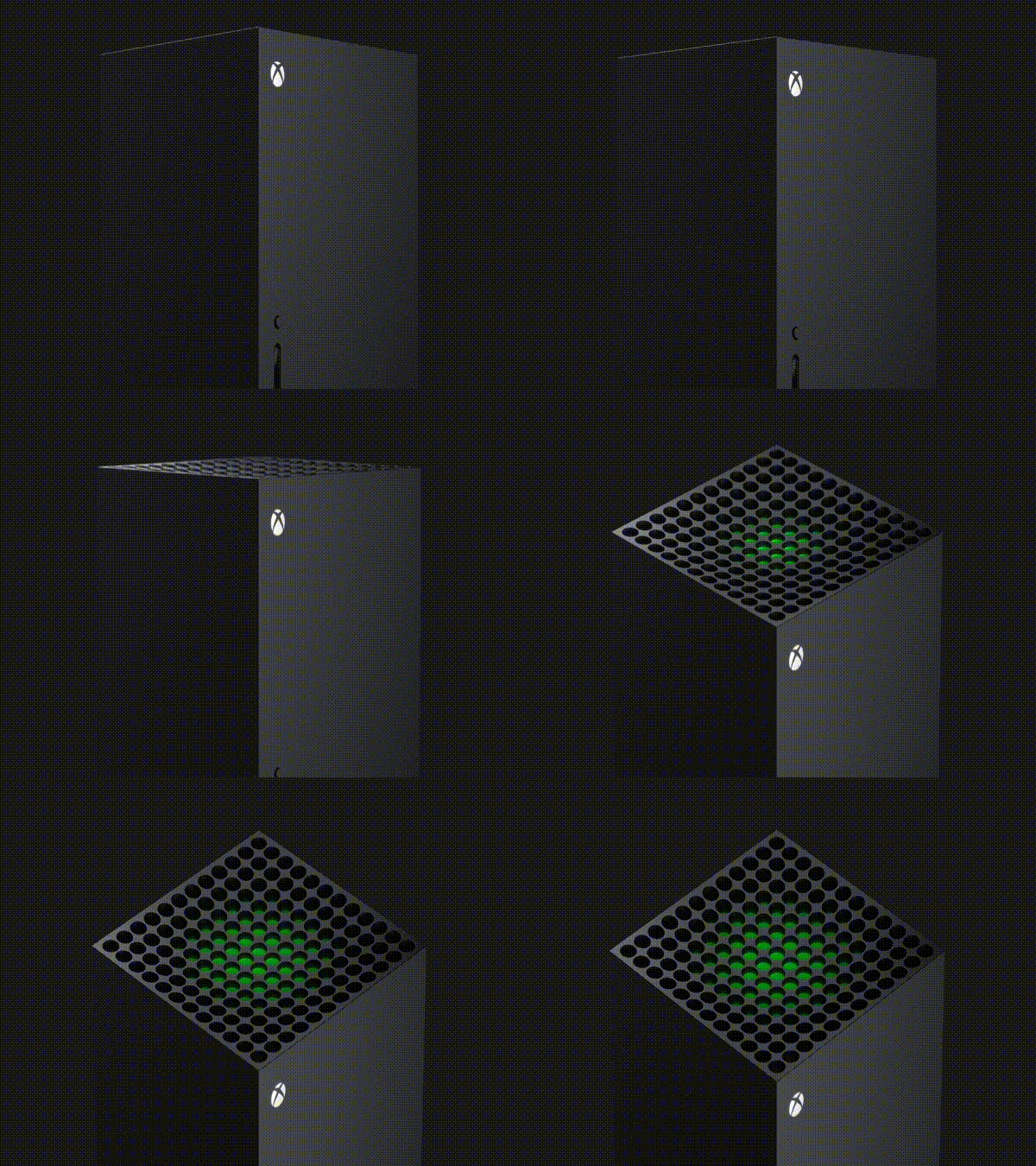
The Xbox Series X moves more air than any console we’ve built before and we know how important it is for the console to operate quietly – that drove a requirement of a higher FAR, and thus, larger holes. To further accentuate the boldness of the vent, we created a dished depression in the top surface, thinning the depth of the holes in the middle and increasing the depth of the holes at the edges. We then added a green accent below that surface in mirrored geometry – thicker in the middle, thinner at the edges – resulting in an optical illusion. As the viewer changes their line of sight, more or less of the green is revealed. We wanted the effect to be as if the soul of the Xbox brand was at the core of the device and as you approach it, the green bloomed and revealed itself.
Could you elaborate on the design language of these consoles in relation to Xbox lineage?
One of the design concepts that stayed consistent with Xbox hardware for years is the way we think about consoles being more architectural and controllers as being more organic. Console architectures, in the sense that they’re often devices that are viewed from afar, tend to have more rectilinear elements and are composed of large silhouettes with small features. A controller is a device you hold in your hands and demands more organic, complex surfaces to meet our ergonomic requirements.
Most designers will tell you it’s more difficult to design something simple than something complex. When there are so few elements of the design, each one must be considered and intentional. One of the things we’re really proud of, and something that most people who own the consoles may never notice, is how elements line up with each other across all the sides of the enclosure – vent patterns to die cut rubber feet, connectors to labels – you can trace the alignment all the way around. We intentionally anchored our vent patterns to be on a grid rather than an offset pattern. The grid-based hole patterns add a visible structure and graphic element to the consoles. Using the grid venting on the circle element for Xbox Series S gave a stronger – though subtle – tie back to Xbox Series X.
The challenge lies in designing a pair of devices that have to speak the same design language but have very different natural characteristics. Tying products like the Xbox Series X, Xbox Series S and the Xbox Wireless Controller together are pure 2D geometric shapes, like a circle. The circle shows up on all our products but at very different scales, different levels of contrast, and in both positive and negative space. Simple elements like a circle have much more flexibility in their execution but still work as a unifying element because of their pure geometric nature.
Our team didn’t stop after creating the forms of the consoles though. When it comes to actually manufacturing those parts, our goal is always to push the limits of injection molding and tooling in order to get the highest quality fit and finish. The steel molds for all our enclosures were chemically etched during the texturing process, instead of being spark eroded. The resulting texture is one with microscopic ridges that are rounder and reflect light more softly – the finished plastic part has almost a painted quality to it and feels nicer to touch.

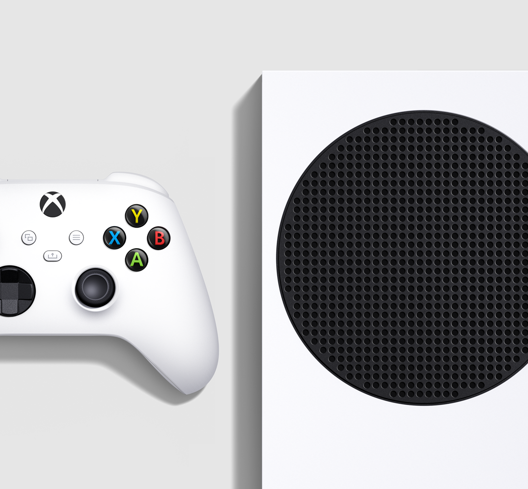
“To simplify the first impression of the console, we wanted to minimize the grid of holes that actually make up the vent by making them a part of the black vent cover and making the internal components beneath it black. We were able to make the read that of a simple black circle inside of a white rectangle.”
The venting on Xbox Series S is also driven by a target FAR, but we were able to mimic the scale of the venting on the Xbox One S. The shape and location of the vent is driven by the location of the fan inside the device – the fan is round and so the perimeter of the vent is a circle. We chose to use that shape as the iconic element of the device and to make it black, in contrast with the white of the rest of the enclosure for a very specific reason.
These are both reductive designs hiding a degree of complexity within. Could you share challenges associated with a design process which seems primarily reductive?
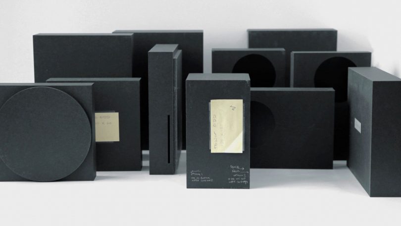
Very early in the program, when we were still evaluating different engineering architectures, we did explore a number of different form factors. What they had in common was the same design philosophy of building from pure geometry and adding detail through functional elements. Our final choice of architecture for Xbox Series X was solidified by taking those different forms to our customers and letting them tell us what worked for them. We had them replace their current consoles with the mockups, tell us what fit in their homes and what felt most new and exciting. We were gratified by how many of our fans chose what would become the Xbox Series X. It gave the team the confidence to do something bold and different.
And what about the subtle texture across the control arms? How and why was this particular pattern chosen?
We did extensive user testing during gameplay to learn how much and how large of texture is enough to break up the surface tension in people’s hands. That nearly microscopic element is another example of the team applying pure geometrical shapes in a functional way. Under magnification, you can see each bump is a rounded circle, only 0.05mm tall, arranged in a grid.
The surface of the controller is super complex though, so each bump was manually placed and arranged in the 3D CAD modeling program. It’s incredibly time-intensive to iterate on a pattern that small, but we did in order to land on a texture that was grippy but not abrasive. Fortunately, we work with some very talented and very patient CAD sculptors.
What does each and the sum of these console designs indicate about the Xbox design ethos?
Intelligent Geometry is how we refer to this approach for designing the way our products look, feel and perform. Our design approach is grounded in functionality and performance, while acknowledging these are products that a gamer, family and household will be living with for years. We know that some of our fans will want to celebrate the console, and for others, they’ll want it out of the way. Our goal is to design for both.
All images/photos: Microsoft

