


As a graphic designer, House Industries has been in my life since the early 2000s, steadily releasing fresh typefaces that made their mark not only within the industry but in the daily lives of everyone, whether they knew it or not. 2024 marks 30 years of the design studio’s fonts visualizing brands from Hermès to Jimmy Kimmel, along with work from other designers who utilize them. To celebrate, they’ve introduced a new limited-edition art and apparel collection in partnership with Autotype, highlighting a few of House’s favorite typefaces and the role fonts play in everyday communication.

The Autotype x House Industries collection came about naturally through the two brands’ love and appreciation of typography, its influence, and the accompanying emotional impact of modern design. We had the chance to speak with House Industries co-founder, Andy Cruz, to gain further insight into the collection and the process behind it.
“House collaborated with Derek Galkin of Autotype on a shoe design for his company, MEDIUM, back in the early 2000s. We remained design pen pals for years, and after a chat about art we’d like to hang in our own homes, we said, Let’s just make it and see if anyone else likes what we like,” Cruz said of their relationship with Autotype.
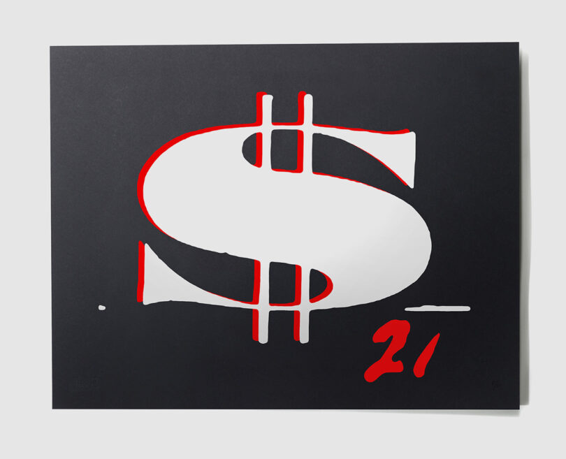
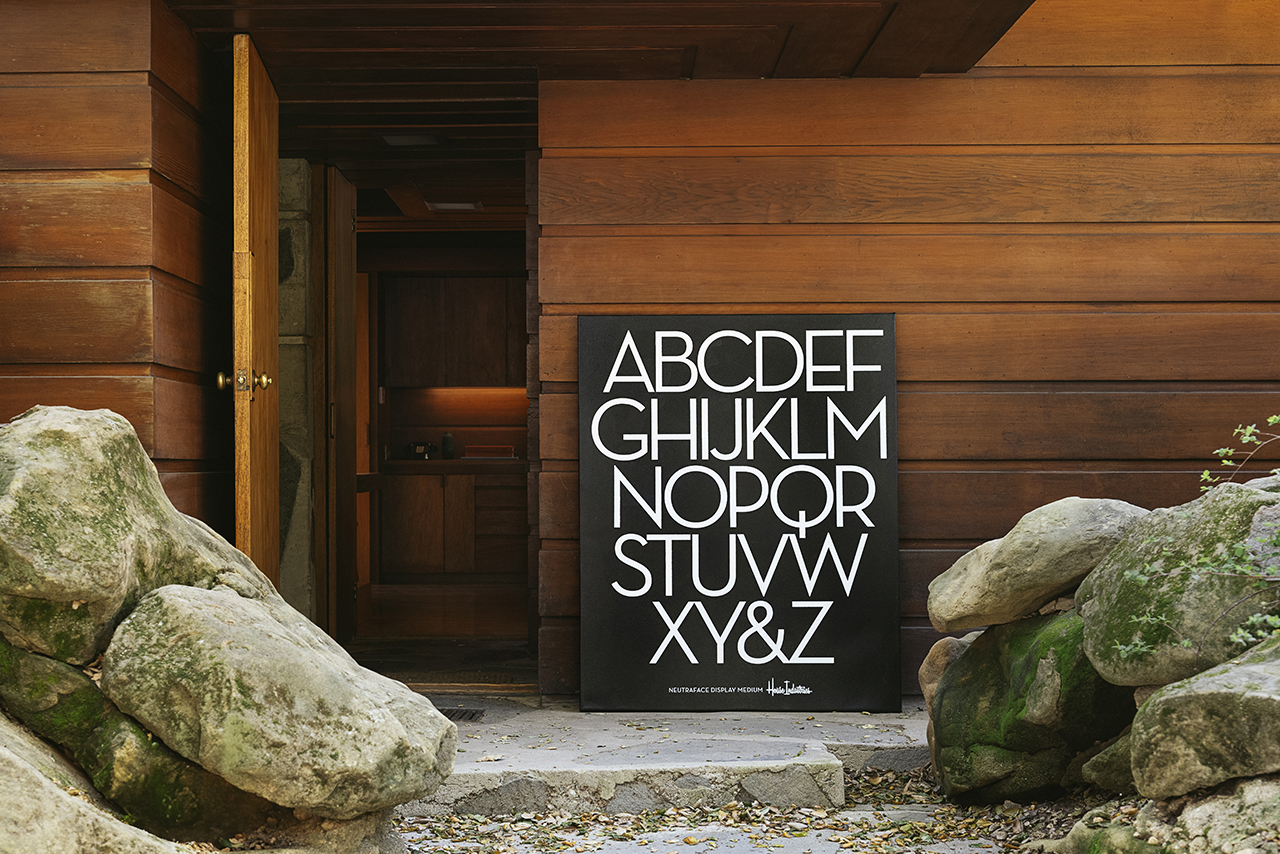
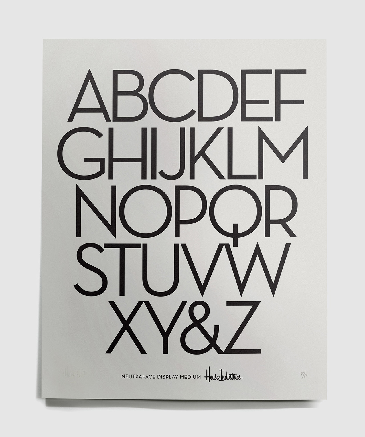
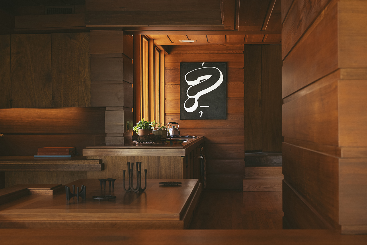
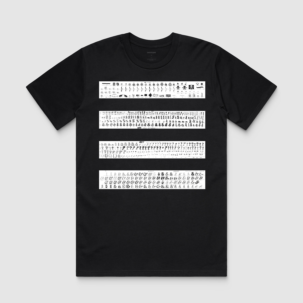
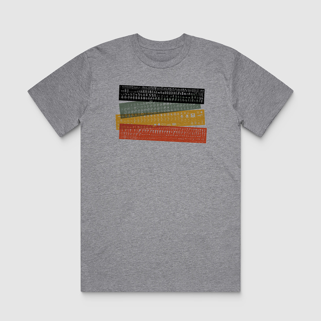
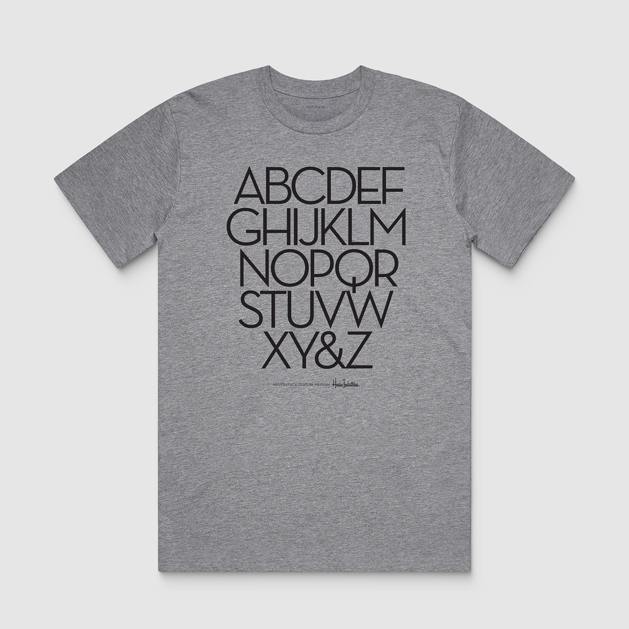
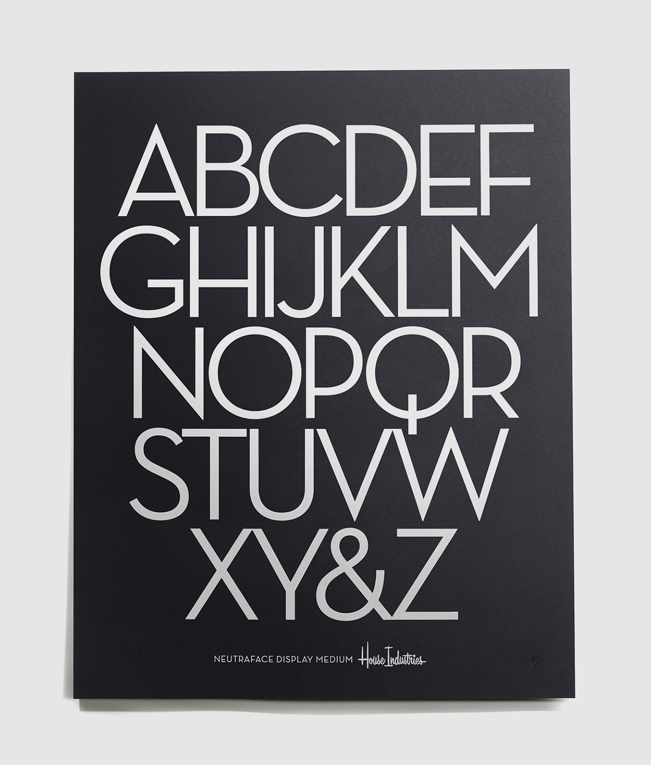
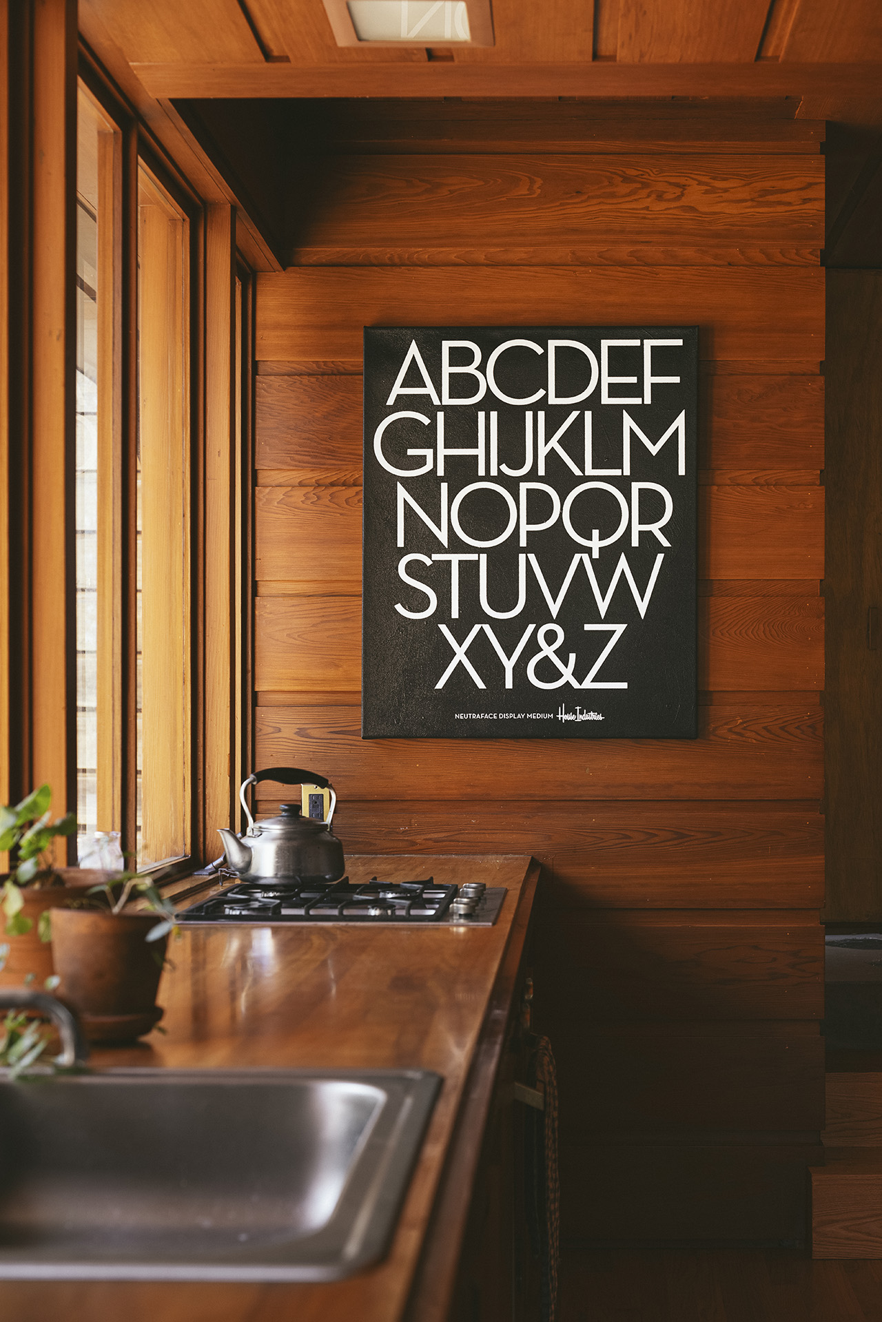
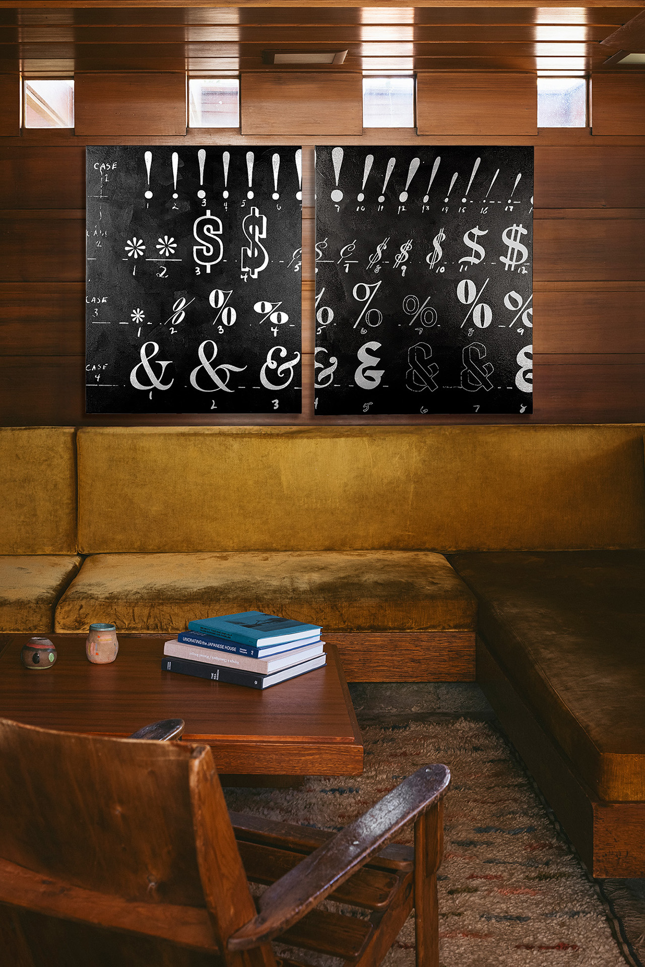
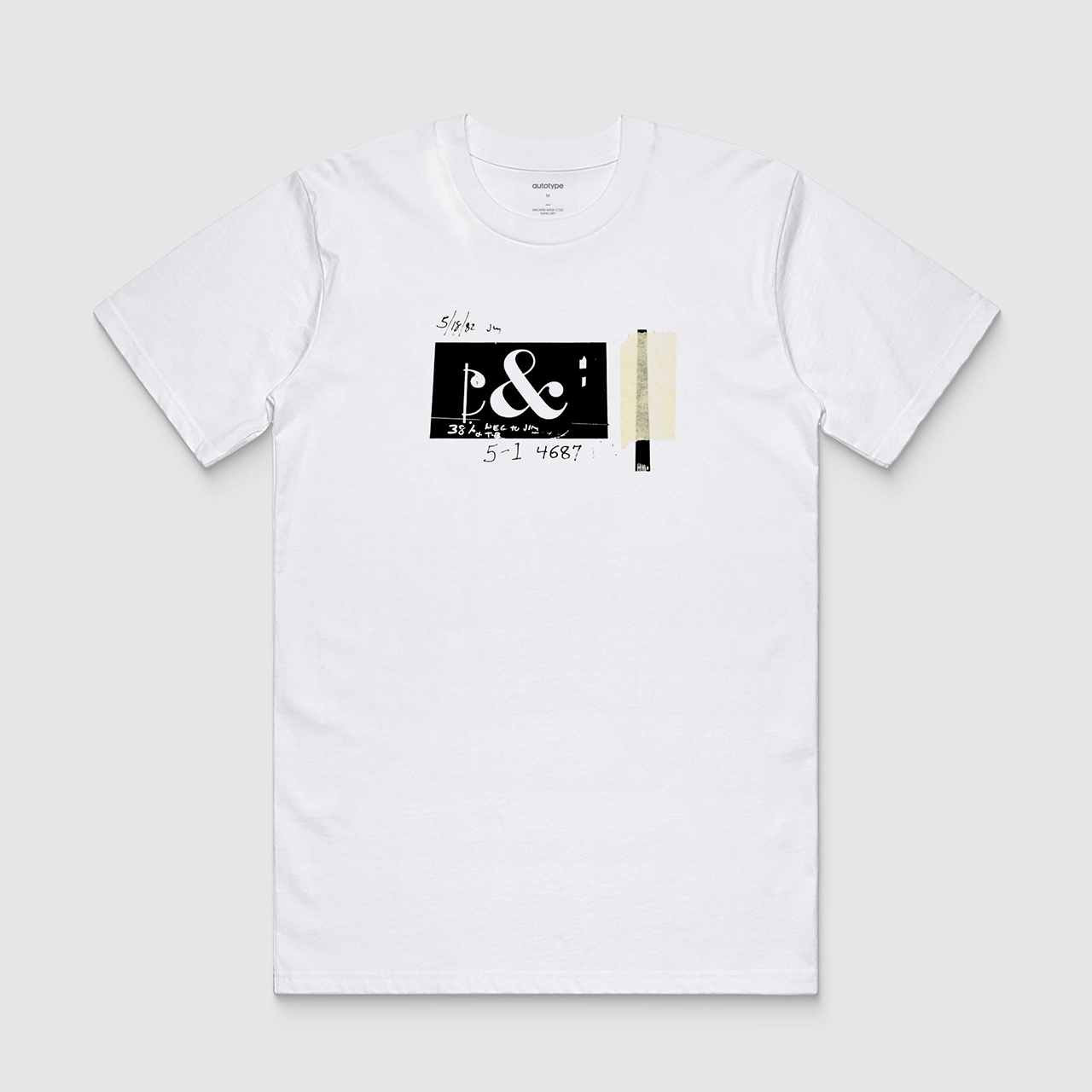
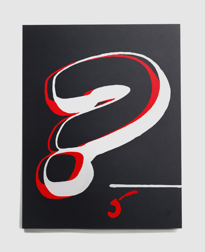
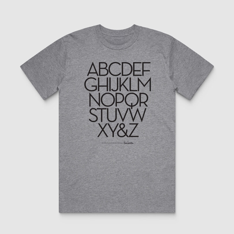
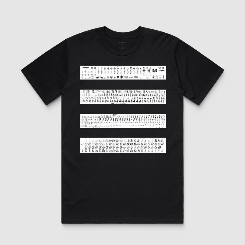
The Autotype x House Industries collection focuses on two concepts: the Neutraface A to Z eye chart and the history of film typography. “After our mandatory procrastination period, we decided one approach would be to go B.C. [Before Computers]: We dusted off some glyphs from our analog type heroes, Photo-Lettering, Inc,” says Cruz. “House acquired the Photo-Lettering archive 20 years ago, and it’s served as an infinite source of inspiration. The other was sharing the geometric elegance of our Neutraface display alphabet.”
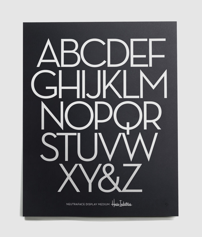
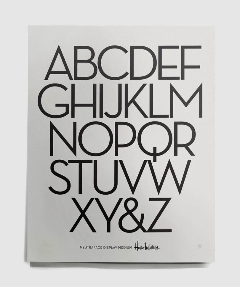
Both ideas were transposed onto t-shirts, two sizes of canvas prints in limited editions of 250 (numbered and with a certificate of authenticity), and hand-pulled 26 x 20-inch serigraph prints. A nonprofit design institution, Letterform Archive, receives 5% of every purchase. Cruz shares: “We’re making a conscious effort to take our 30 years of design, form, and brand knowledge to a larger audience than font users. “House-wares” has a nice ring to it.”
However, I couldn’t let Cruz go without asking the ultimate question: What’s your favorite font that you’ve designed? His response spoke a truth that creatives the world over can relate to. “The one that sells the best. That might sound crass, but we’ve designed several fonts that only a few see the beauty in… but the best sellers allow us to keep making the stuff we love regardless of popular opinion.”


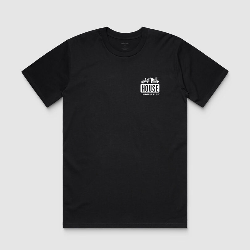
Factory Tee (front)
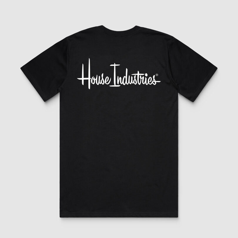
Factory Tee (back)


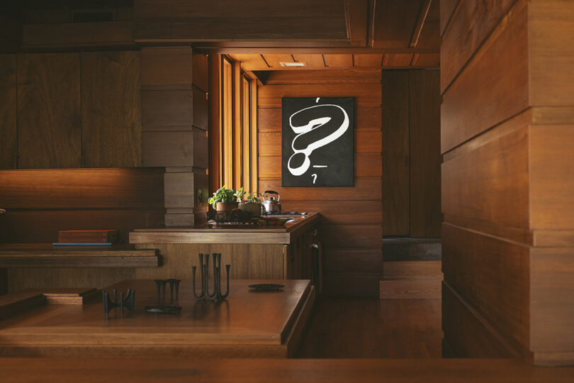
Question Tee (front)
Question Tee (back)
To explore the Autotype and House Industries collection further or pick up a piece for yourself, visit autotypedesign.com or the Los Angeles location of Heath Ceramics, where it is exclusively available.