


Awhile back, Flavor Paper reached out to see if I’d be interested in creating some custom wallpaper, a service the Brooklyn-based wallpaper gods are known for. I thought, “Why not?” I bought a small loft a little over a year ago and it’s sadly remained undecorated due to lack of time.

I only have this one before photo because it was just a dull grey box with a bed in it and who wants photos of that? PLEASE DON’T JUDGE ME!!
I figured this opportunity was a brilliant place to start considering I’ve (and Design Milk) been quite obsessed with the brand for years. They offer so many designs, it’s unreal. After perusing the website, I knew for sure that I wanted an Andy Warhol design, which is a collaboration with The Andy Warhol Foundation for the Visual Arts, who granted Flavor Paper access to a good portion of Warhol’s work. After many hours of staring at each pattern longingly, I selected a long-time favorite: Flowers and didn’t look back.
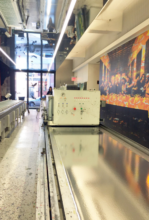
The next step was to visit the Flavor Paper headquarters (which we featured in this Where I Work) to begin the design process.
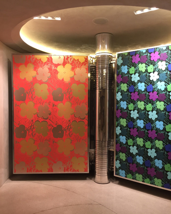
On display in the Flavor Paper showroom
After drooling over their showroom and wallpaper books, I talked with Flavor Paper owner Jon Sherman who guided me when it came to color options. They have SO. MANY. CHOICES.

As much as I wanted to go with something completely bold, like the color story above, I dialed it back a notch since my place is teeny tiny.

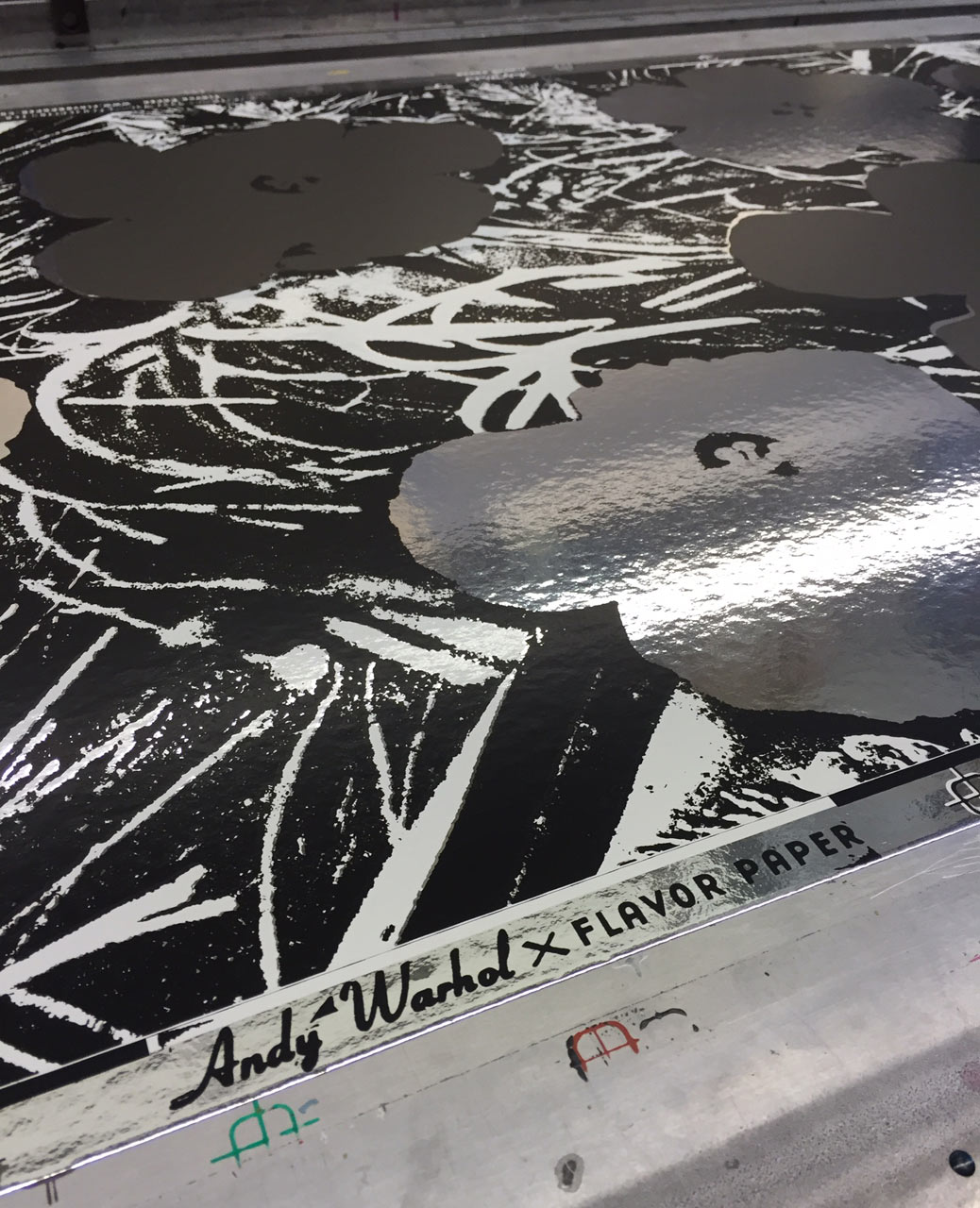
We went back downstairs to where the magic happens and as soon as you step foot into the space, you see all the colorful splatters that land on the floor during the printing process.

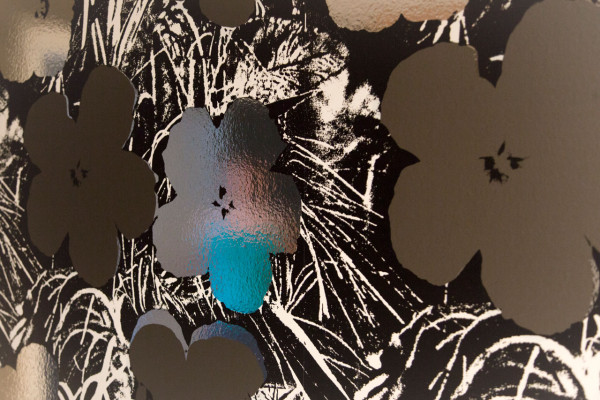
I was still tempted by the neon, but I ended up choosing silver mylar paper, which would show as flowers, with matte grey for the other flowers, and matte black and glossy white for the background colors.
Mylar paper is laid out and ready to be printed.
Paint stirring!

The first screen is ready to print the first layer.
Inking the screen.
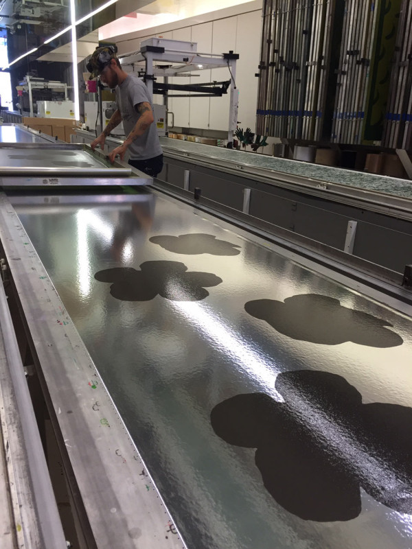
It starts getting real with the grey flowers going down first.
White layer going down!
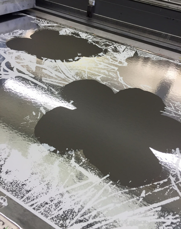
And now the black layer…
It’s almost done – time for it to dry.

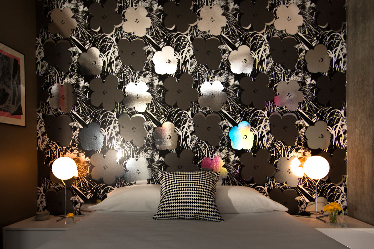
It looks even better than I thought! Next stop, the bedroom…!

I decided I was only going to do one wall since the space is so small and with so much metallic it was going to look like Andy Warhol’s Factory, just miniature sized. I knew the color palette would look good with the already grey walls so that meant I didn’t have to paint. I wanted to keep the rest of the room fairly monochromatic, so I kept everything black, white, and silver, with a little bit of color. My favorite thing about the wallpaper is everything that it reflects. Anything you bring into the room, whatever color you’re wearing, and depending on what lights are on, it looks different all the time and gives the room this dreamy feeling.
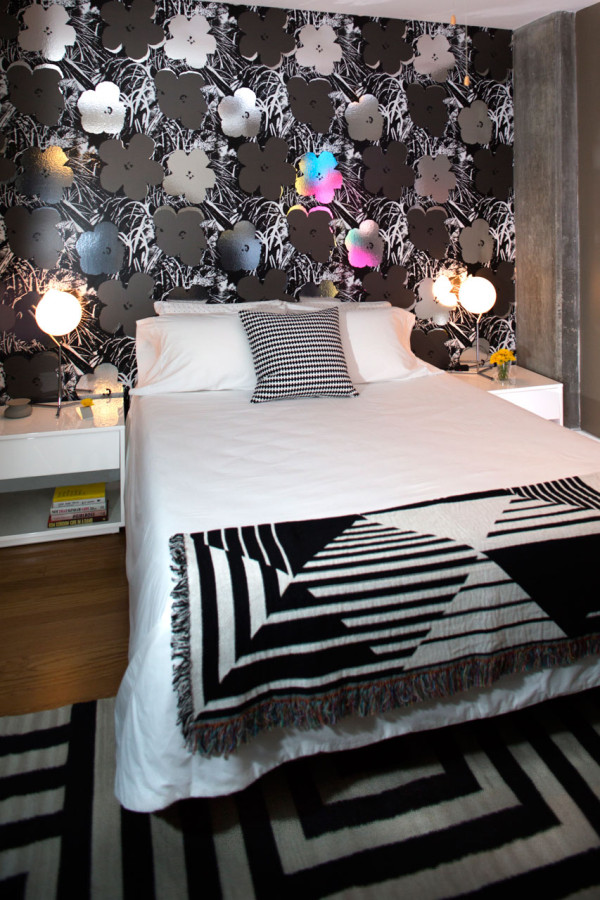
The wallpaper led the design for the rest of the room. I’ve always loved MASHstudios and recently they designed some pieces for CB2, so I jumped on the Shake Nightstands. The glossy white finish bounces even more light around the window-less room. Then came lighting. I’ve been eyeing Michael Anastassiades’ new FLOS pieces and finally decided on the IC Lights T1 and they’re incredible – simple, yet sculptural. They’re not overpowering in front of the wallpaper, and instead, complement it perfectly. I kept the bedding clean and white (from IKEA) with a single IKEA Stockholm pillow. To keep the white bed from being boring, I added a graphic throw from Matt W. Moore to continue the black and white theme. Lastly, I bought the Kate Spade Saturday rug from West Elm, which funnily enough, Jaime used in her bedroom reveal last summer (no longer for sale)!
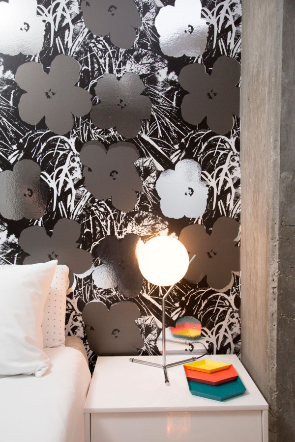
I love mixing the accessories up because everything pops off of the white nightstands and reflects in the wallpaper.
After photos by Raymond Goodman.
Videos by Flavor Paper.
What do you think?