Iconic home + office furnishing brand Herman Miller expands their Archival Poster Collection with 5 historical pieces by in-house designers.
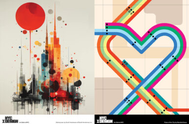
Nine talented NYC artists pay homage to the creative spirit of the city with a series of posters illustrating the New York of tomorrow.
Legendary design brand Herman Miller is opening up the vault to release 8 posters featuring the iconic archival designs of Alexander Girard.
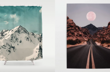
Embrace mid-winter with the help of some majestic mountain art from Society6!
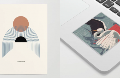
Share your Aquarian pride with some unique art from Society6 that you can wear, use in your daily routine, or simply admire on the wall.
We know you're awesome, so check out these favorites from Society6 to help get you back up on that high again when you need it most.
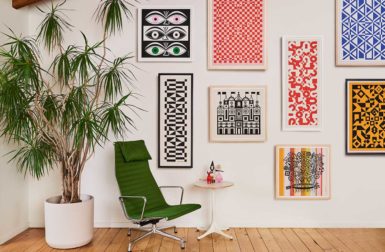
These vibrant posters and multi-piece wood wall art will give your blank white walls a new look.
We found some fun works of modern art, at varying price points, that anyone would love to receive as a holiday gift.
From a 3D printed aquarium to graffiti art to a life-size LEGO caravan, take a look back at the most popular art we featured in 2016.
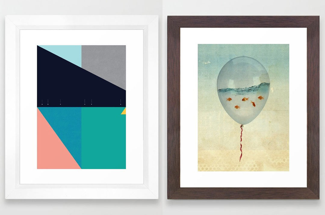
We're wrapping up our themed Society6 posts with some of our favorite framed art prints.
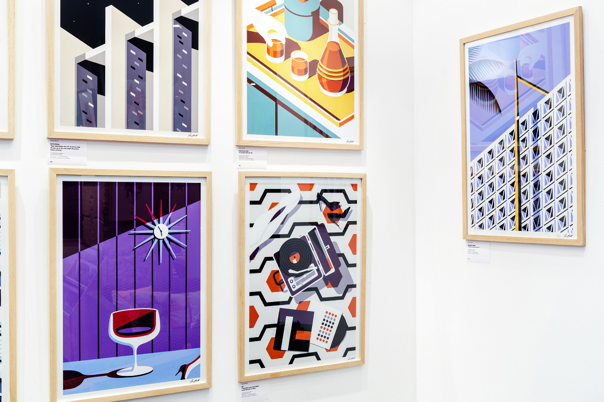
A collection of mid-century inspired prints that came about after a trip to Palm Springs.
Posters that reference four iconic movies in an abstract, minimal way.
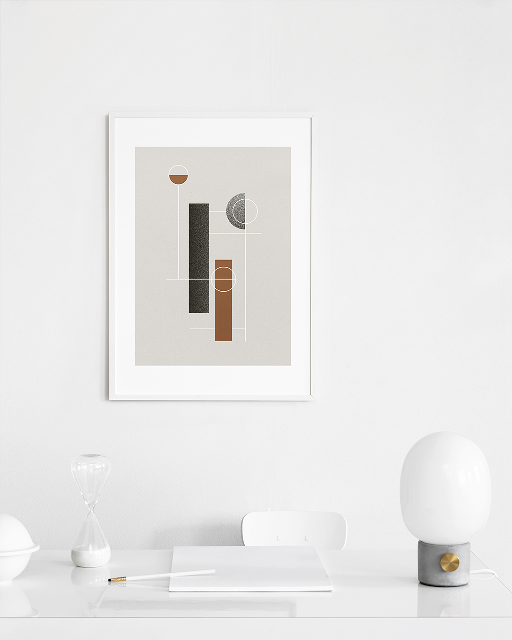
A minimalist collection of art prints featuring circles and outlines.
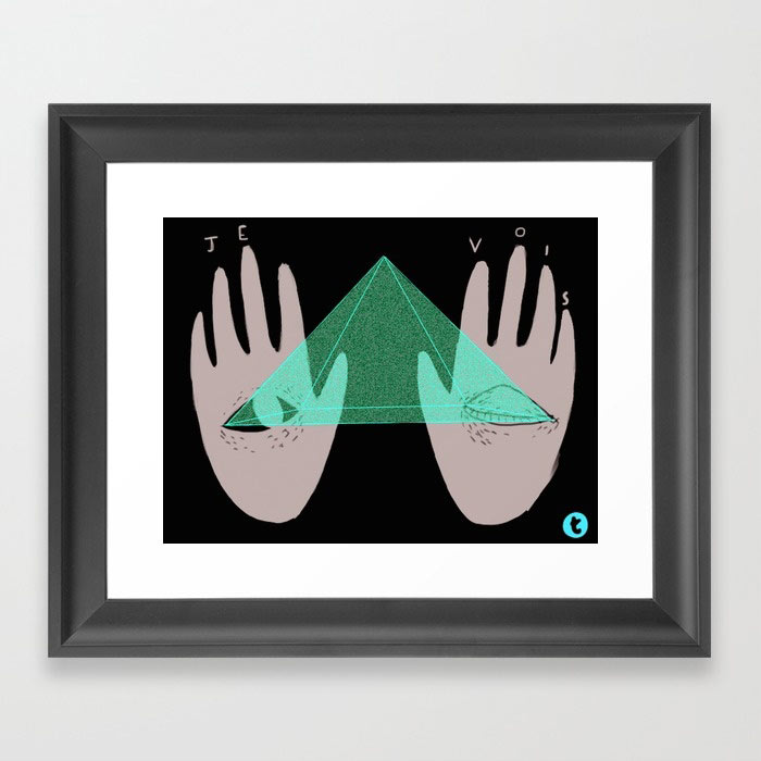
A series of minimal art prints that examine the human form.
Prepare to have your aura read with these spiritual and mystical Society6 finds...