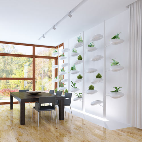
Architecture


Color Pop: Paul Kariouk's Architecture and Interiors
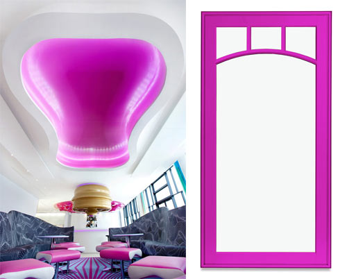
The carefully chosen, rich hues that Ottawa-based architect Paul Kariouk uses in his work make quite an impact, though the actual number of colors is fairly limited. An aqua-tinged navy paired with an almost neon orange, bar red against the forest greens, and acid pink and green are all inspiring pairs. For CMYLK, using Colourlovers palette tool, we picked those out, and then filled in the blanks with the neutrals.
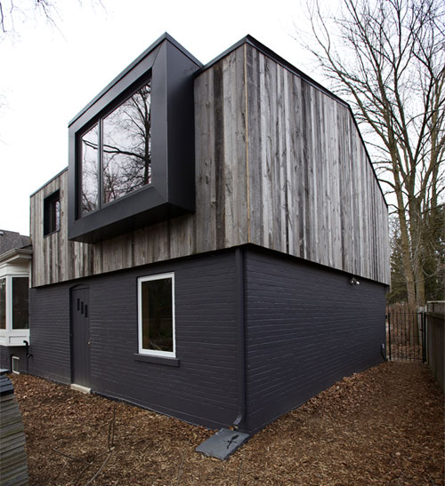
Modern Bungalow Addition with Pops of Blue by The Practice of Everyday Design
Longtime Eden House homeowners were looking for additional space in their Canadian home so they brought in the designers from The Practice of Everyday Design to renovate the space above their garage. Their desire to keep the look of their bungalow but also to give them the space they desired led to this loft-like retreat that's accessed by a hidden staircase in the dining room.
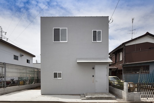
KDR House by International Royal Architecture (I.R.A.)
KDR House is a minimalist home located in Tokyo, Japan, designed by International Royal Architecture. The kitchen, bathroom, and stairs are congregated within the center of the home with a completely open floor plan surrounding this space. The architects kept a simple palette of materials used throughout both the exterior and interior.
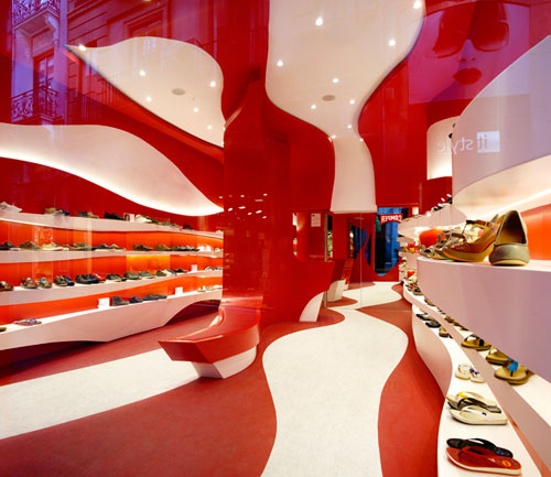
Curvy Red and White Camper Shoe Store Renovation by A-cero
A-cero was tapped to renovate a little space in Granada, Spain to become the city's first Camper store. The Spanish shoe brand always chooses a different concept for each of its stores that they open based on the designers they collaborate with. A-cero was the perfect pick, being innovators in the world of design and all. Bonus: red and white are favorite colors of both companies.